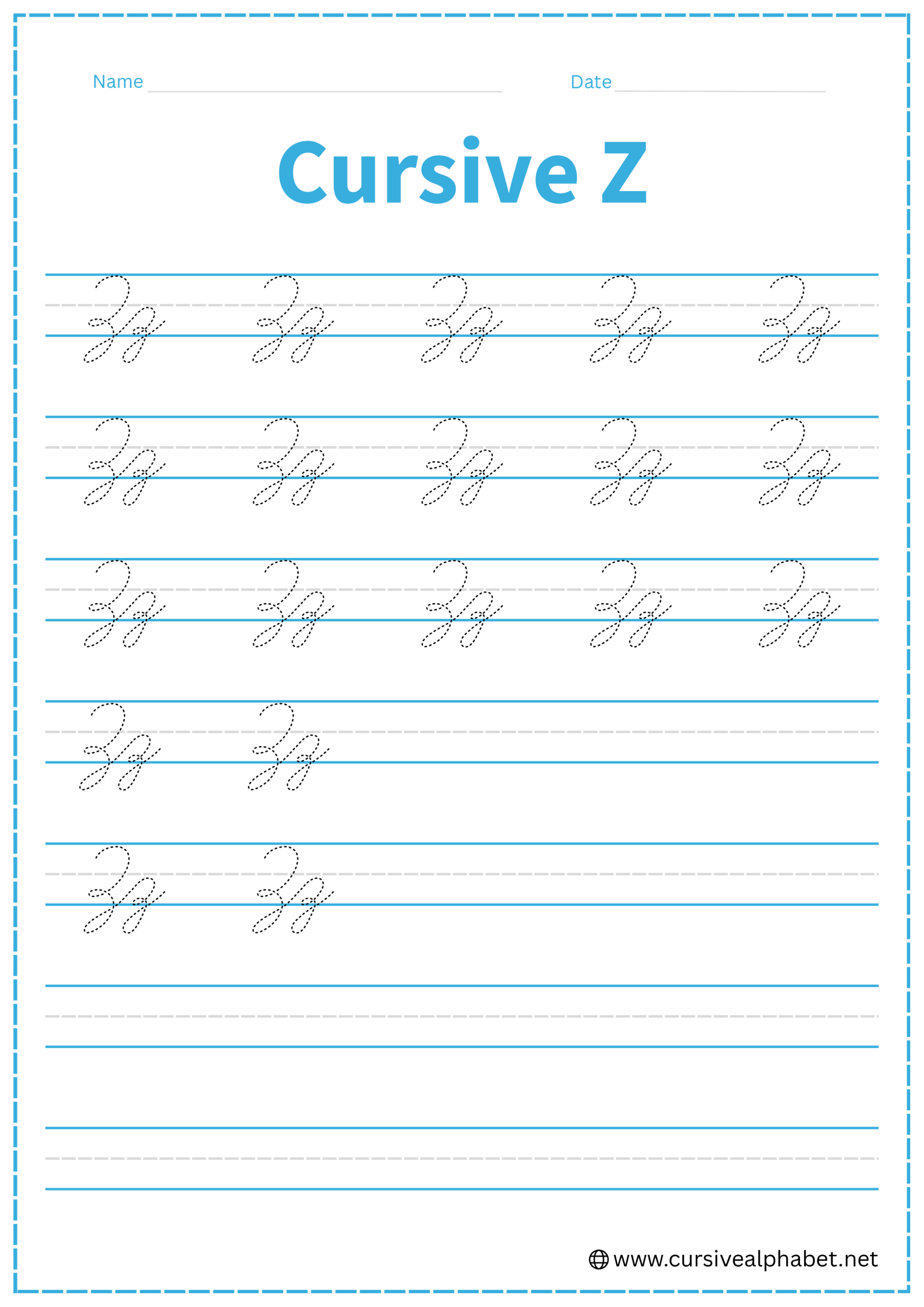
Cursive Z
On this page, you will get free printable cursive Z worksheets and a step-by-step guide on how to write both uppercase and lowercase cursive letter Z.
How to Write Z in Cursive
We have reached the end of the alphabet! The cursive Z is often considered the most “eccentric” letter because it looks absolutely nothing like the printed version. It features a double-humped shape with a tail that dives into the basement.
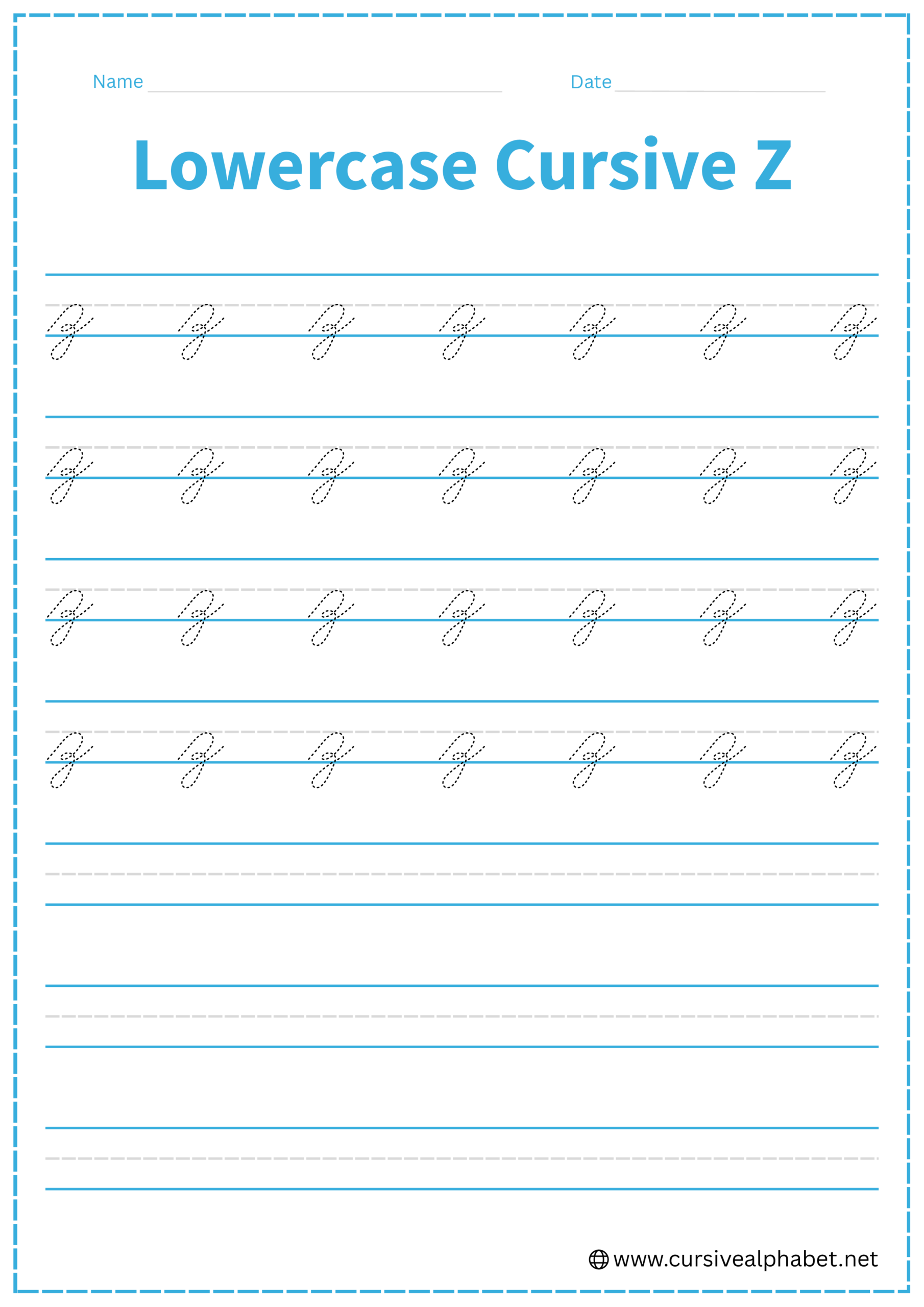
How to Write Lowercase Cursive Z
The lowercase z stays between the bottom baseline and the middle dashed line, with its tail dropping below.
- Start on the bottom baseline and sweep up to the middle dashed line.
- Curve over to the right and drop down, but instead of hitting the baseline, stop just slightly above it.
- Make a smaller, tighter hump that touches the bottom baseline.
- From that second hump, drop straight down into the “basement.” Curve to the left and sweep back up.
- Cross the vertical stem exactly at the bottom baseline and flick upward to the right.
Mistakes to Avoid:
- Making it look like a “3”: While it has two humps, the bottom loop must go below the line to be a cursive z.
- Looping to the right: Like the y, g, and j, the z must loop to the left.
- Forgetting the first hump: If you only make one hump and a loop, it looks like a messy g.
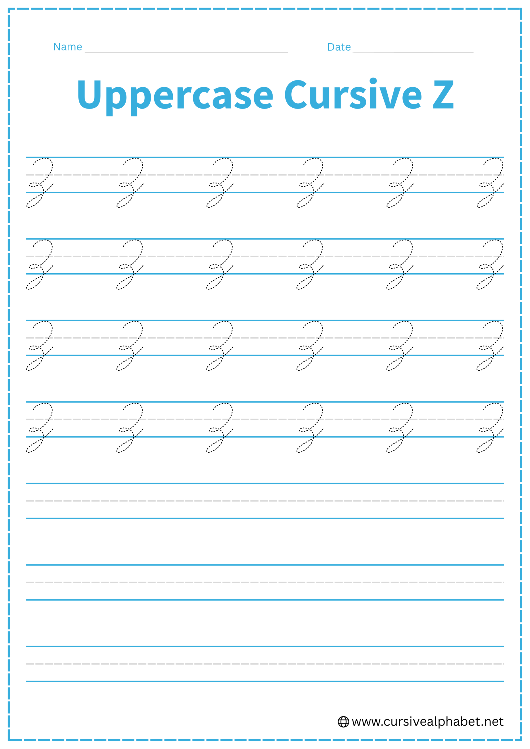
How to Write Uppercase Cursive Z
The uppercase Z is a grand, sweeping letter that fills the entire space from the top line to the baseline.
- Start near the top line with a small downward hook or “cane” shape.
- Sweep over to the right along the top line and curve down toward the middle dashed line.
- At the midline, make a tiny horizontal loop or “knot” before starting the second part.
- Curve down to the bottom baseline.
- Drop below the baseline, curve to the left, and sweep back up to cross at the bottom baseline.
- Finish with a tail heading toward the midline to join the next letter.
Mistakes to Avoid:
- Confusing it with “L”: An L stays on the baseline; a Z must have a tail that goes below it.
- Making it too straight: Cursive Zs should be very rounded and “bouncy” looking.
Frequently Asked Questions
Yes! The tail that crosses at the baseline flows naturally into the next lowercase letter for smooth handwriting.
Its unique shape comes from historical cursive styles that prioritized speed and fluidity over printed forms.
Y has a smooth top curve, while a z has two distinct humps and a bottom loop that dips into the basement.
Yes! Start with the initial upstroke, form both humps, drop into the loop, and finish with the exit flick in one flowing motion.
Avoid making it look like a 3, looping to the right, or skipping the first hump, as these distort the letter’s classic cursive form.