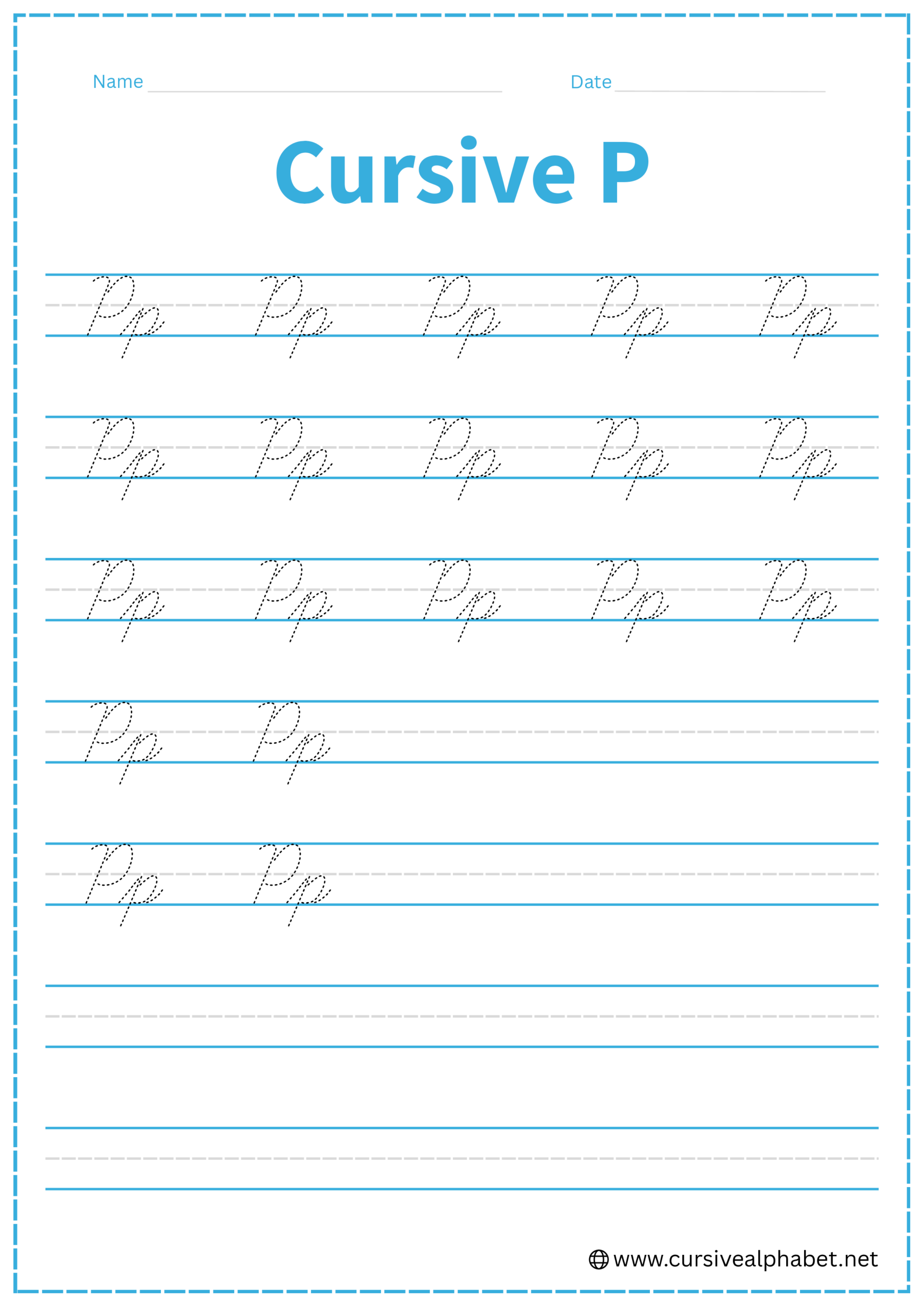
Cursive P
Mastering the cursive letter P allows you to create tall, refined letters with seamless, graceful strokes. On this page, you will get free printable cursive P worksheets and a comprehensive guide to write for both the uppercase and lowercase cursive P.
How to Write P in Cursive
The cursive P is a standout letter because both the uppercase and lowercase versions have a distinct “stem and cap” structure. However, they sit on the lines very differently.
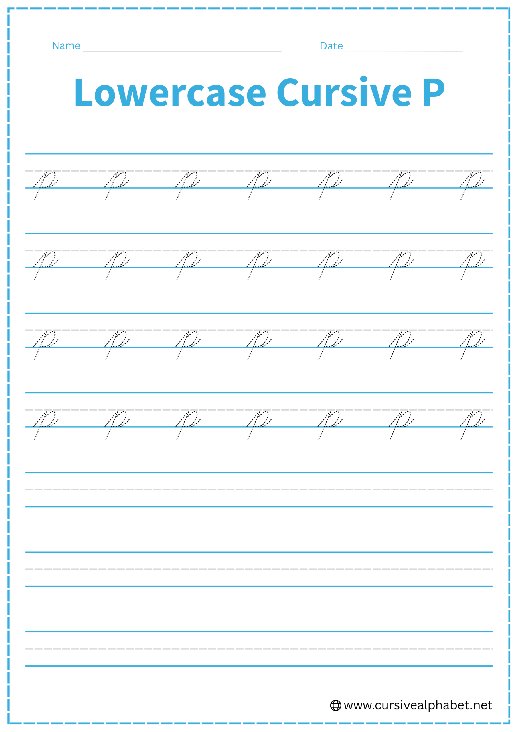
How to Write Lowercase Cursive P
The lowercase p is a “descender,” meaning it starts on the baseline but dives below it.
- Start on the bottom baseline and sweep up at a slant to the middle dashed line.
- Pull your pen straight down, passing through the baseline into the “basement” (the space below).
- Move your pen back up the same stem to the middle dashed line.
- Curve out to the right and around, touching the bottom baseline and tucking back into the stem.
- Flick back out to the right from the baseline to connect to the next letter.
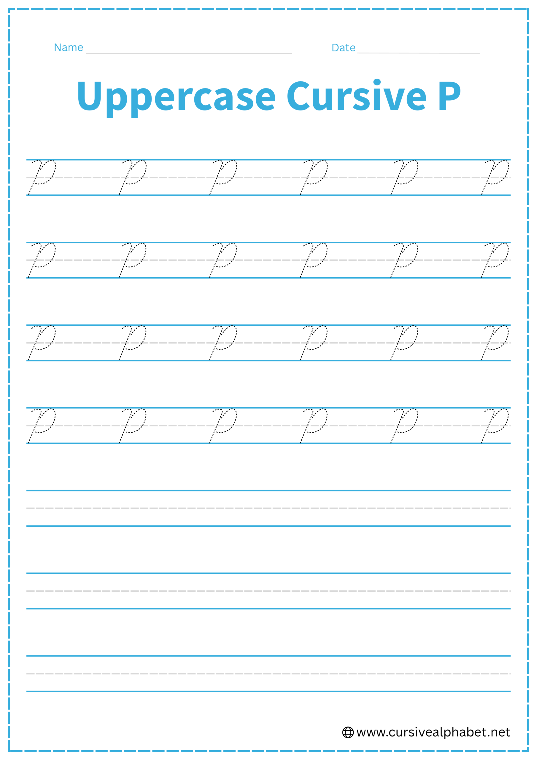
How to Write Uppercase Cursive P
The uppercase P is elegant and usually starts with the stem first.
- Start at the top line and draw a slanted line down to the bottom baseline, finishing with a small curl to the left.
- Lift your pen (or retrace up) and start back at the top line.
- Sweep out to the right in a wide, rounded curve.
- Bring the curve back in to touch the stem at the middle dashed line.
- Most styles do not connect the uppercase P to the next letter; the stroke ends where it meets the stem.
Common Mistakes to Avoid
Lowercase Cursive P
- Looping the bottom of the stem: In most standard cursive (like Palmer), the bottom of the p is a straight line, not a loop.
- Lifting your pen: Like most lowercase letters, this should be one continuous motion.
- Making the belly too wide: Keep it proportional to the height of the midline.
Uppercase Cursive P
- Starting at the bottom: The uppercase P almost always begins at the top.
- Leaving the cap open: Ensure the “belly” of the cap actually touches the vertical stem at the midline.
- Making it look like a “D”: A P stops at the middle line, whereas a D continues all the way to the bottom.
Frequently Asked Questions
Usually, no. Because the stroke ends at the middle of the stem, it’s difficult to flow into another letter. You simply lift your pen and start the next letter right after the stem.
While all three descend below the line, the p has a closed “belly” on the baseline, while j and g use loops that sweep back up to the right.
Yes! If you don’t retrace the stem, the letter looks like a disconnected circle and line, which is harder to read at speed.
The uppercase P reaches from the top line to the baseline. Its loop or cap touches the stem at the middle dashed line for proper proportion.
Common mistakes include looping the bottom of the lowercase P, making the belly too wide, starting the uppercase P at the bottom, or leaving the cap open so it looks like a D.
Short daily practice sessions, 5–10 minutes, are best. Focus on smooth, flowing strokes to build consistency and confidence.