Cursive G
Cursive G is an important letter for smooth, elegant handwriting. Learn step-by-step how to write uppercase and lowercase G, and use free worksheets to practice.
Download Free Printable Cursive G Worksheet
Practice the uppercase and lowercase cursive letter G with free, downloadable worksheets. These free cursive G worksheets will help you trace, write, and improve your strokes, leading to confident, neat, and flowing cursive handwriting.
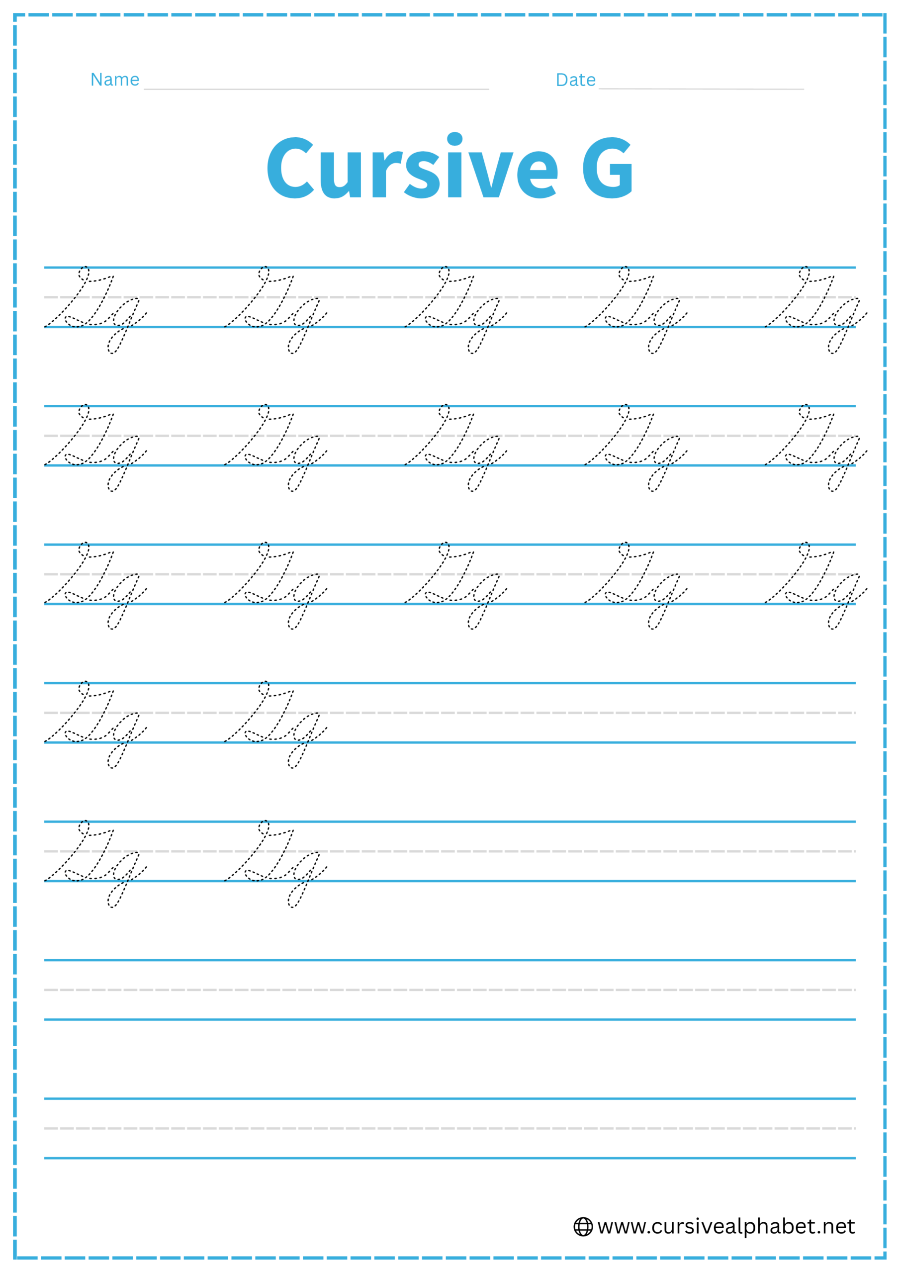
How to Write G in Cursive
The cursive G is one of the most stylish letters because of its dramatic loops and curves. It’s important to note that the uppercase and lowercase versions look quite different from each other.
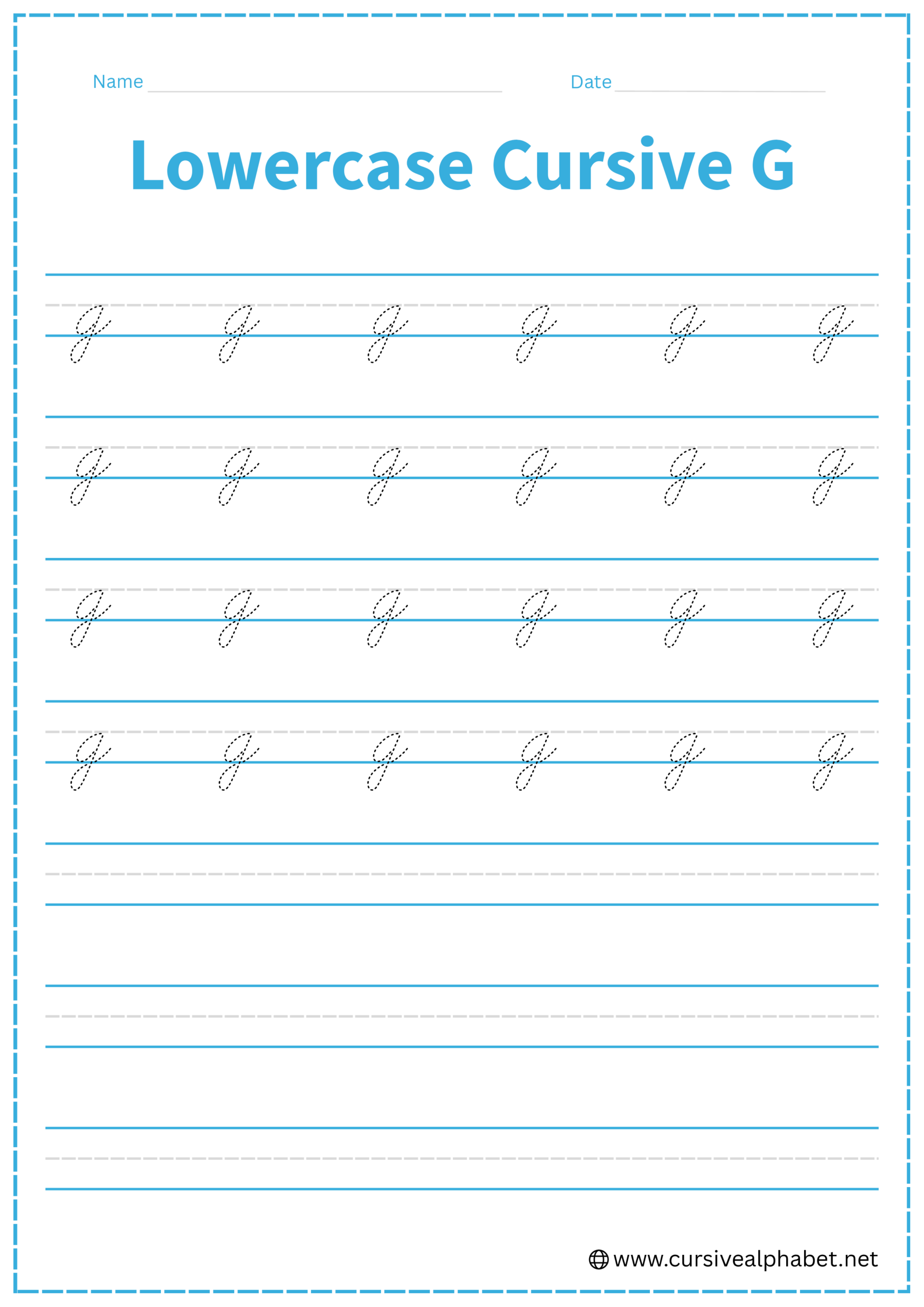
How to Write Lowercase Cursive G
The lowercase g starts exactly like an a but drops below the baseline.
- Start on the bottom baseline and curve up to the middle dashed line.
- Stop, retrace back around to the left to form a closed oval, and touch the bottom baseline.
- From the top of the oval, draw a straight line down past the bottom baseline.
- Curve to the left and sweep back up toward the bottom baseline.
- Cross the descender line exactly at the bottom baseline and flick upward toward the middle dashed line.
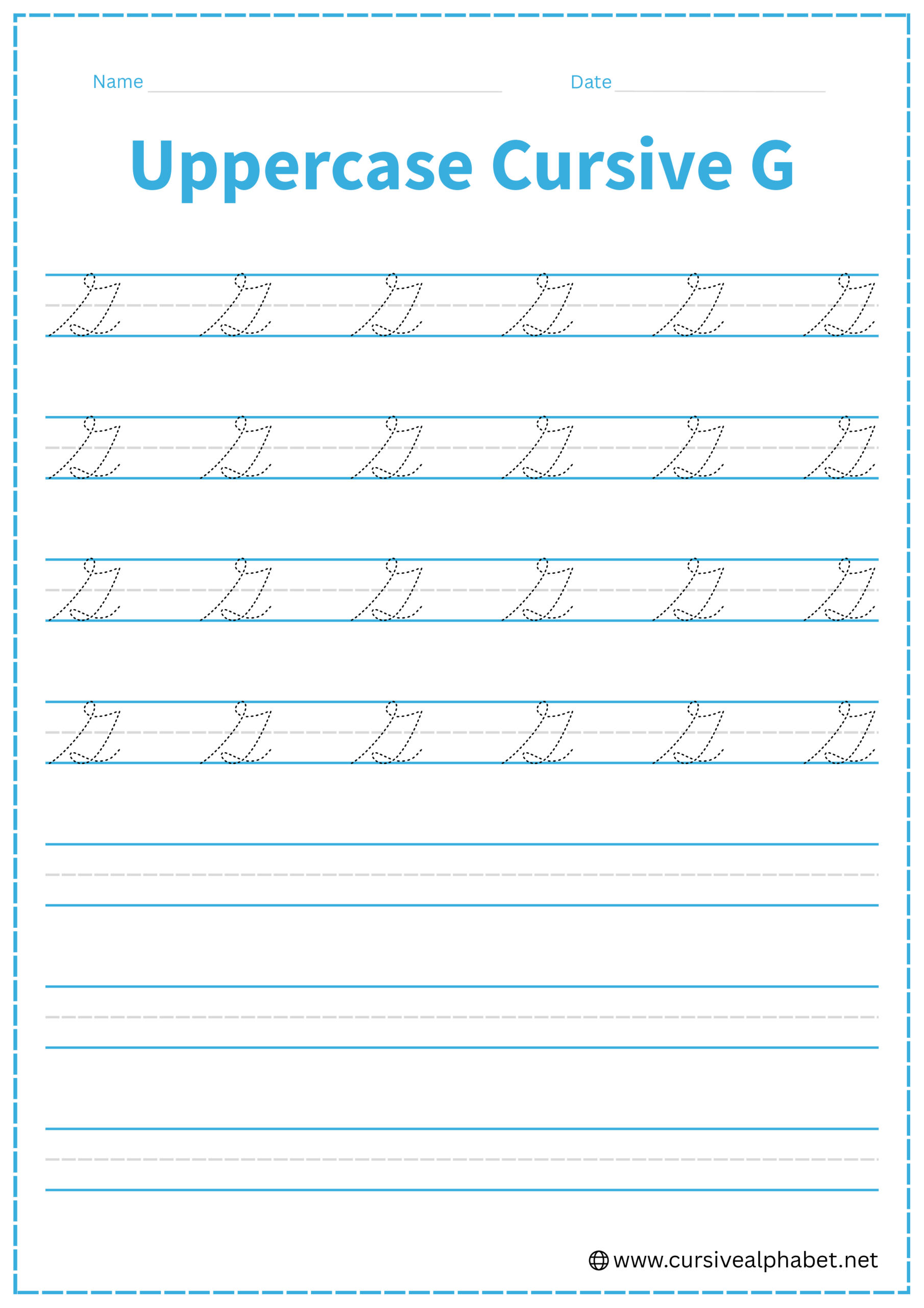
How to Write Uppercase Cursive G
The uppercase G is a tall, sweeping letter that starts at the bottom and climbs up.
- Start at the bottom baseline and sweep a long, slanted line all the way to the top line.
- Curve to the left and back down, crossing your initial upstroke near the middle dashed line.
- Curve back up and slightly to the right to create a “point” or a small horizontal shelf at the middle dashed line.
- Drop straight down from that point, passing through the bottom baseline.
- Curve to the left below the baseline and sweep back up to cross at the bottom baseline.
Common Mistakes to Avoid
Lowercase Cursive G
- Looping the bottom to the right instead of the left.
- Leaving the oval open at the top, which makes it look like a y.
- Crossing the exit stroke too high above the baseline.
Uppercase Cursive G
- Making the top loop too small compared to the rest of the letter.
- Starting at the top line instead of the bottom baseline.
- Forgetting the interior “point” at the midline, which makes it look like a large S.
Frequently Asked Questions
The cursive G is one of the most distinct departures from print. While a printed G is a simple open curve, the cursive version is built on a “climbing” motion that starts at the bottom baseline, loops at the top, and features a unique interior “point” or shelf. This design allows it to flow more naturally into the rhythmic movement of cursive writing.
This is a common challenge! The key difference is the interior point and the descender. An uppercase S stays above the baseline and closes with a small “boat” shape at the bottom. An uppercase G, however, has a distinct horizontal “shelf” at the midline and must drop below the baseline into a tail.
The bottom loop (the descender) of a lowercase g should always curve to the left. If you curve it to the right, it may be mistaken for a cursive f or a stylized j. Remember: “Left for G, Right for F.”
This usually happens if the oval base (the “head” of the g) isn’t closed at the top. To ensure it looks like a g, make sure your stroke returns all the way to the middle dashed line to “seal” the oval before you drop down into the descender.
For both uppercase and lowercase G, the exit stroke (the tail that leads to the next letter) should cross the vertical stem exactly at the bottom baseline. Crossing too high or too low can make the handwriting look cramped or messy.
Yes! Unlike some other capital letters, the uppercase G ends with a tail that crosses back through the baseline, making it very easy to transition directly into the next lowercase letter without lifting your pen.