Cursive I
Cursive I is an important letter in the cursive alphabet. Here you’ll find simple instructions and printable worksheets to help you practice writing the letter neatly.
How to Write I in Cursive
The cursive I is a study in simplicity and elegance. The lowercase version is small and sharp, while the uppercase version is known for its wide, flowing base.
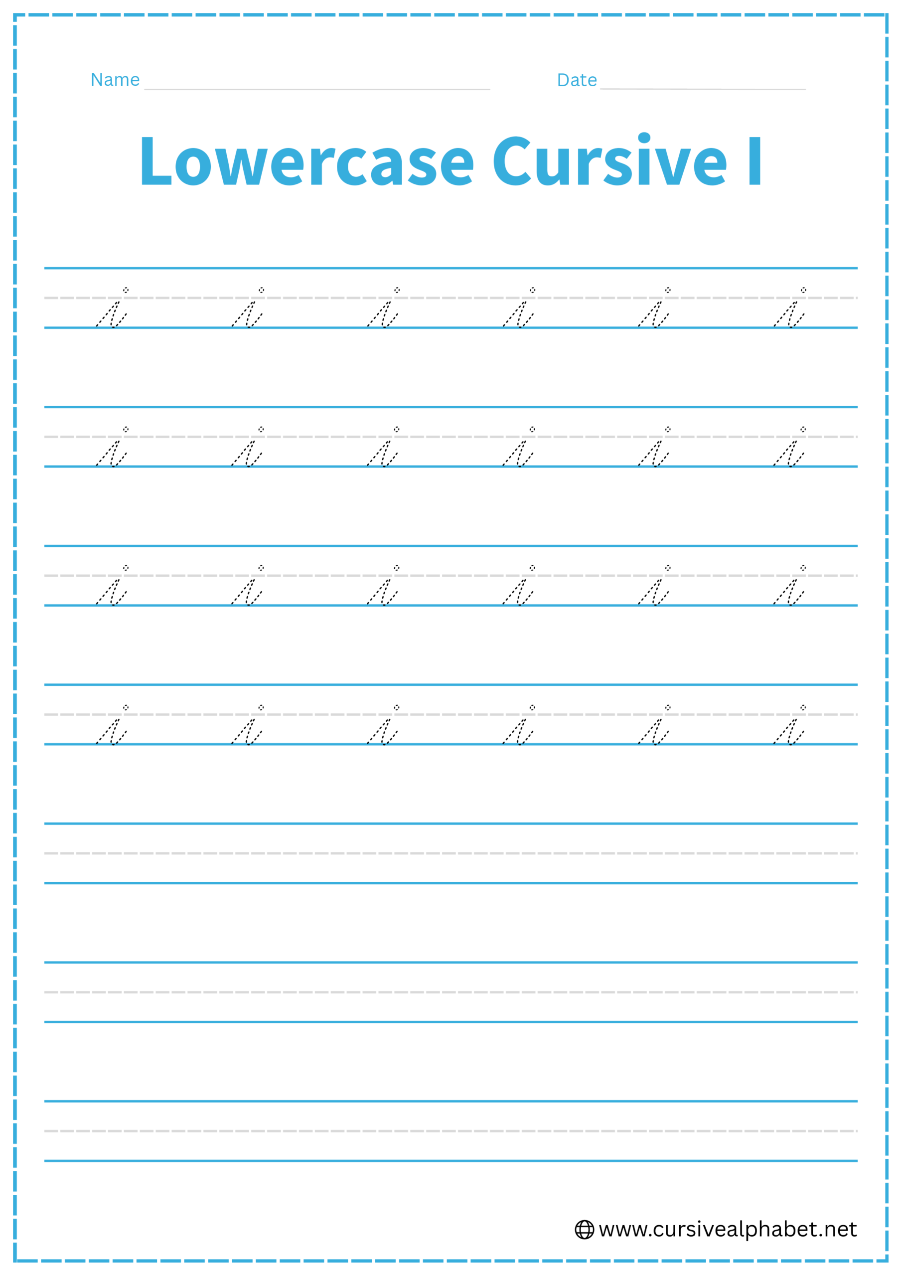
How to Write Lowercase Cursive I
The lowercase i sits entirely between the bottom baseline and the middle dashed line.
- Start on the bottom baseline and slant upward to the middle dashed line.
- Move your pen directly back down the same line you just drew, about halfway.
- Curve away from the stem to the right, touching the bottom baseline and flicking back up toward the midline.
- Lift your pen and place a single, clean dot centered just above the middle dashed line.
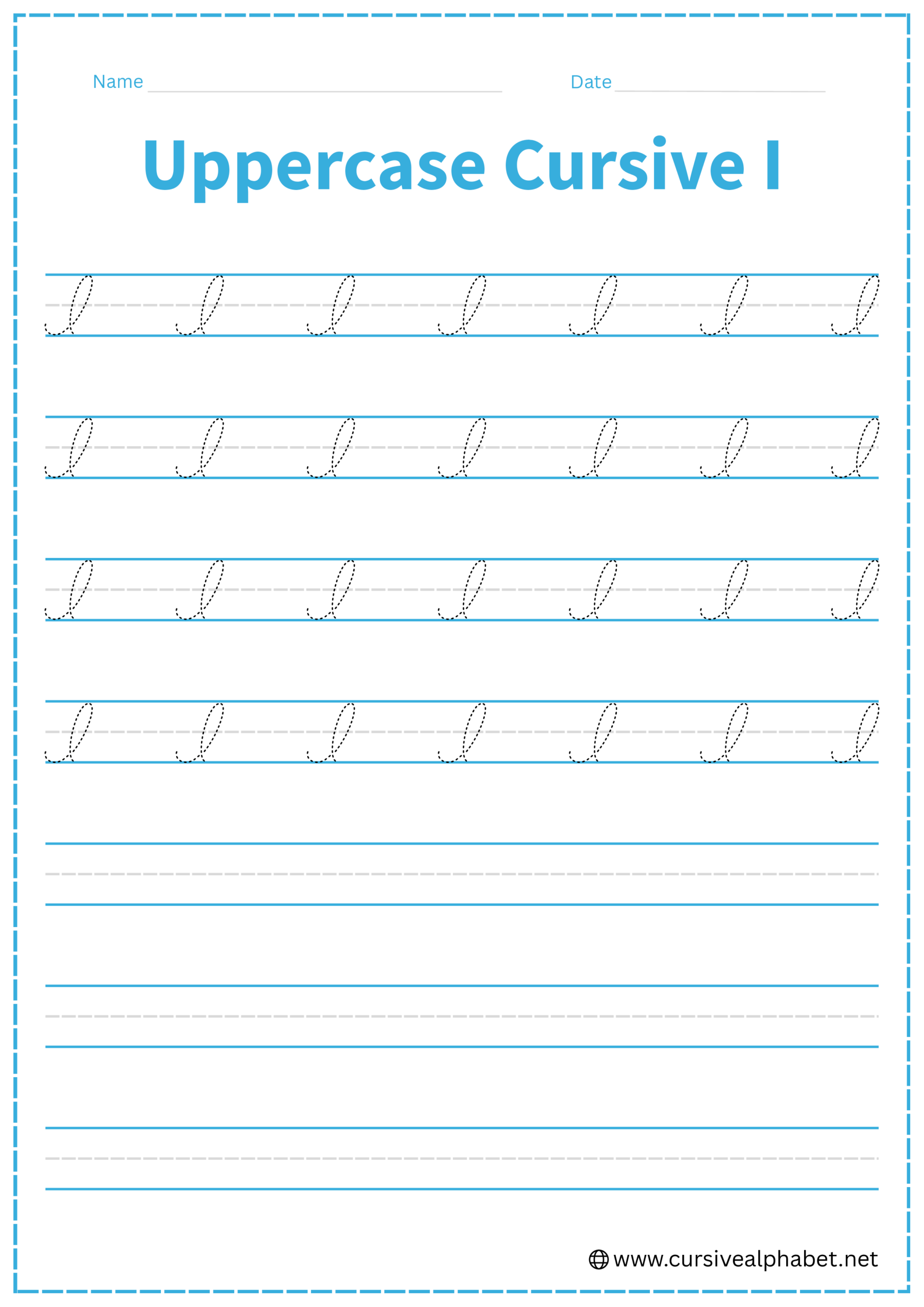
How to Write Uppercase Cursive I
The uppercase I starts with a backwards motion and is one of the few letters that begin by moving to the left.
- Start just above the bottom baseline and curve upward and to the left in a wide arc.
- Continue the curve all the way up to the top line, crossing over your starting point.
- From the top line, draw a slanted vertical line straight down to the bottom baseline.
- Finish by curling the tail to the left as it rests on the bottom baseline.
Common Mistakes to Avoid
Lowercase Cursive I
- Looping the stem instead of retracing it, which makes it look like a small e.
- Placing the dot too high or touching the top line.
- Forgetting the exit stroke, which is essential for connecting to the next letter.
Uppercase Cursive I
- Starting at the top line instead of near the bottom baseline.
- Making the bottom loop too narrow instead of a wide, confident base.
- Crossing the middle dashed line too early on the way up.
Frequently Asked Questions
This is the most common mistake! It happens when you create a loop instead of retracing your stroke. To keep the i sharp, you must move your pen directly back down the same line you just went up before branching out for the exit stroke. If there is “daylight” or a hole in the middle of the stem, it will be read as an e.
The dot should be a clean, singular mark placed just above the middle dashed line. Avoid making it a large circle or “bubble,” and try not to place it too high toward the top line, as this can make your handwriting look disconnected and messy.
Unlike many other capital letters, the cursive I begins near the bottom baseline. You start with a wide upward curve to the left before reaching the top line. Starting from the top is a common habit from print writing that can make the cursive version look distorted.
They look very similar! The key difference is the baseline. An uppercase I sits on top of the bottom baseline and ends with a small curl to the left. An uppercase J, however, must drop below the baseline to form a tail in the “plumbing” or descender area.
The initial stroke of the uppercase I moves to the left and upward to create its signature, elegant loop. This unique “backwards” start gives the letter its classic, flowing appearance and helps distinguish it from the uppercase S or L.
In most formal cursive styles, the uppercase I is a non-connecting letter. Because it finishes with a curl to the left on the baseline, you typically lift your pen and start the next lowercase letter slightly to the right of the I without a connecting stroke.