Cursive Y
On this page, you will get free printable cursive Y worksheets and a step-by-step guide on how to write both uppercase and lowercase cursive letter Y.
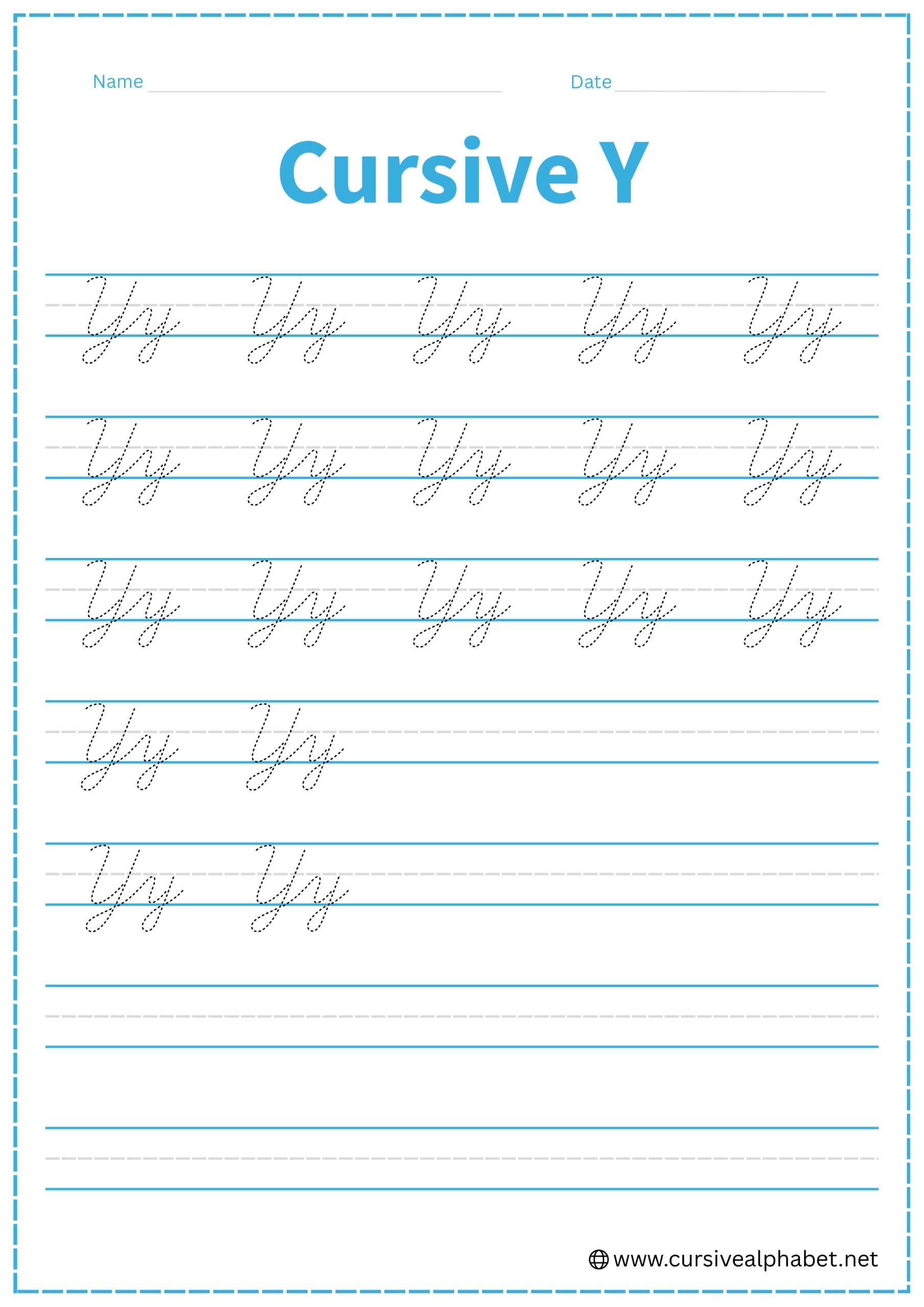
How to Write Y in Cursive
The cursive Y is one of the most elegant letters in the alphabet. It combines the “cup” shape of the letter u with a long, sweeping “descender” loop that goes below the baseline.
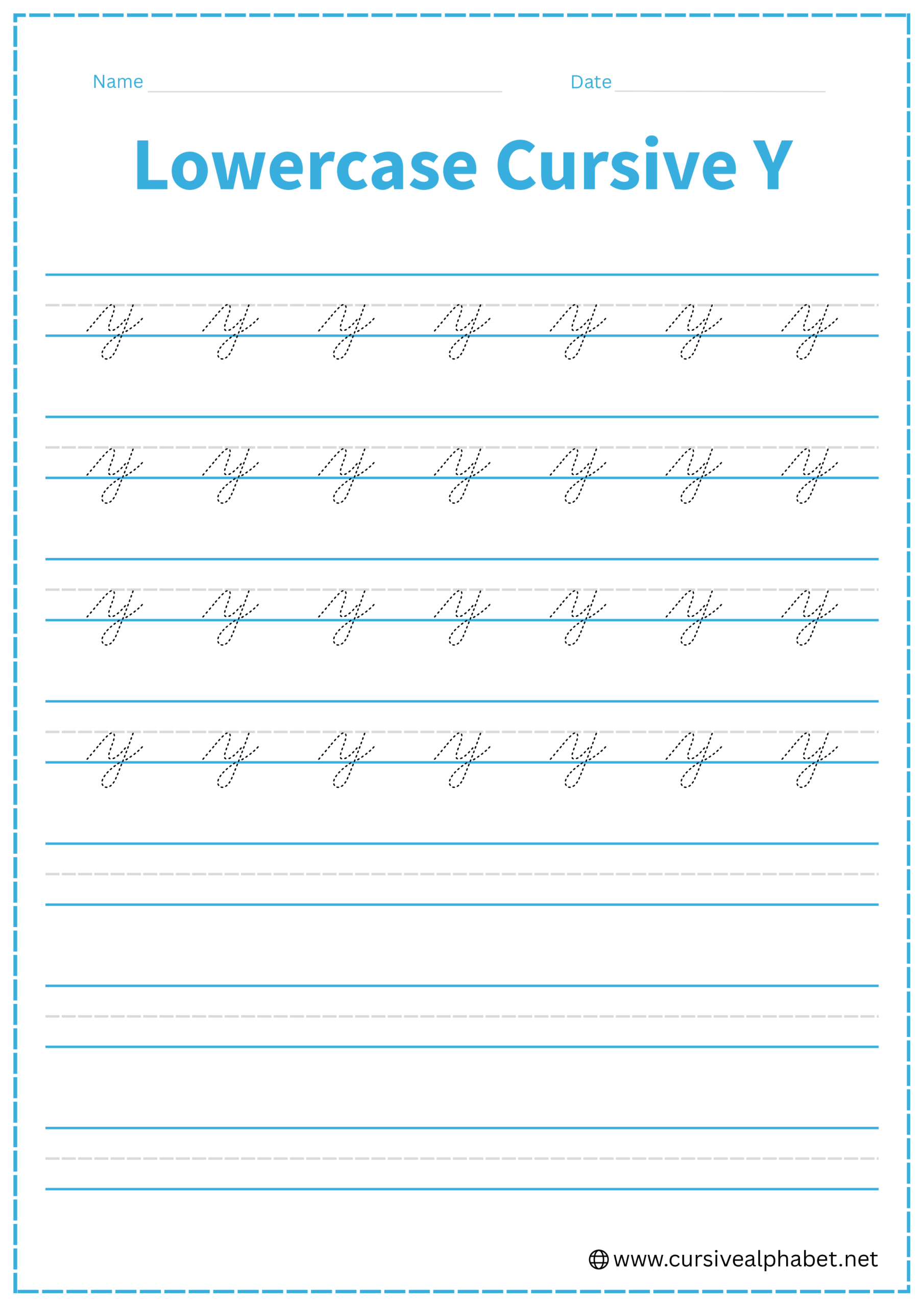
How to Write Lowercase Cursive Y
The lowercase y starts on the baseline, reaches the middle line, and then dives into the “basement.”
- Start on the bottom baseline and sweep up to the middle dashed line.
- Drop back down to the baseline, curve smoothly to the right, and head back up to the middle dashed line (just like a lowercase u).
- From the middle line, pull a straight, slanted line all the way down below the bottom baseline.
- Curve to the left and head back up, crossing your stem right at the bottom baseline.
- Finish with a flick upward to the right to connect to the next letter.
Mistakes to Avoid:
- Looping to the right: Always loop to the left (toward the start of the word). Looping right makes it look like a q.
- Making the cup too narrow: Give it enough room so it doesn’t look like a pointed J.
- Crossing too high or low: The loop should cross exactly on the bottom baseline for a clean look.
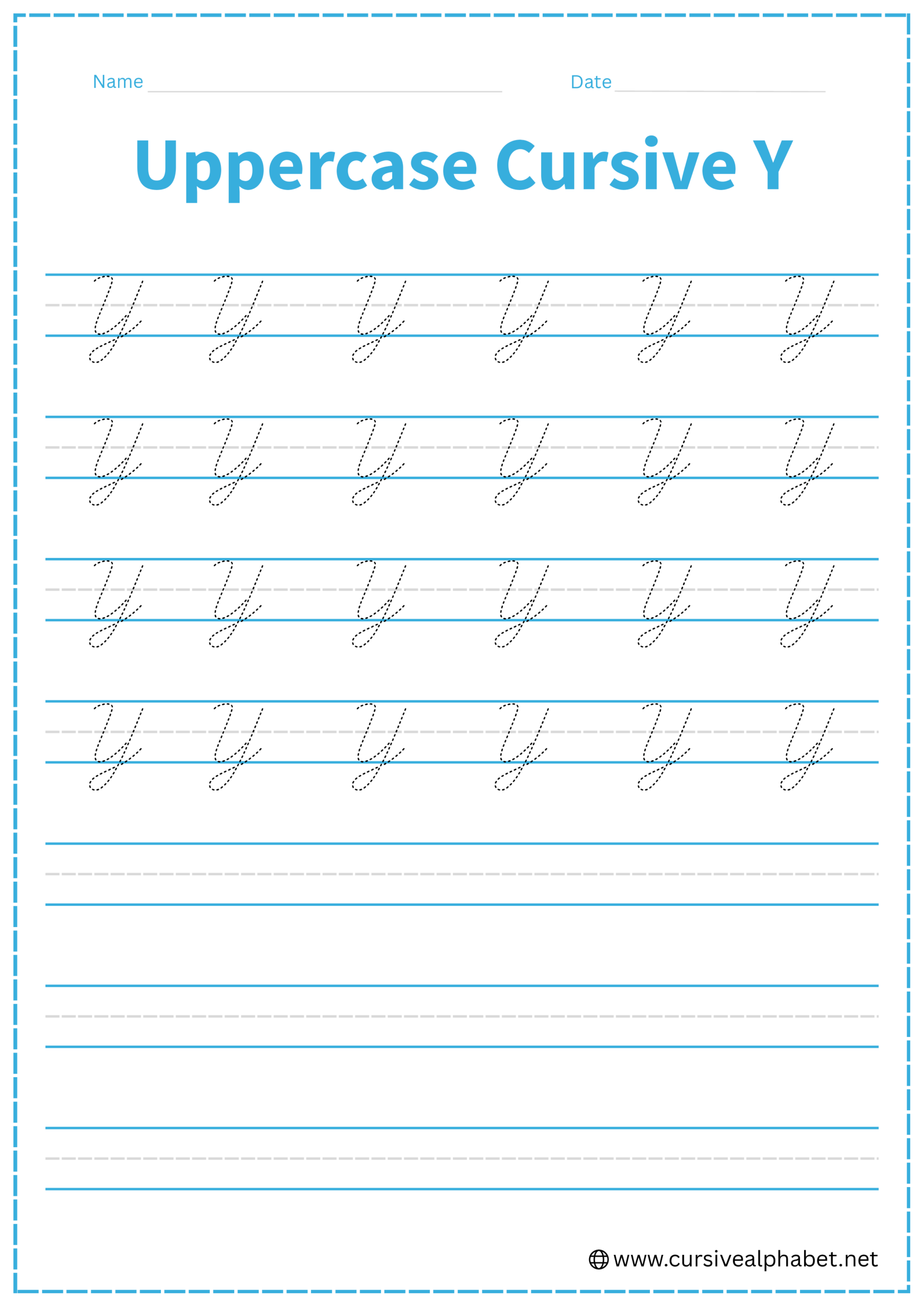
How to Write Uppercase Cursive Y
The uppercase Y is a large, flowing version that fills the entire space from the top line to the bottom.
- Start near the top line with a small downward hook or curve.
- Sweep down to the bottom baseline, curve wide, and sweep back up to the top line.
- From the top line, draw a long, straight slanted line all the way down below the bottom baseline.
- Curve to the left and sweep back up to cross at the bottom baseline.
- Finish with a tail that heads toward the middle line to join the next letter.
Mistakes to Avoid:
- Stopping at the baseline: An uppercase Y must have its tail below the line; otherwise, it looks like an uppercase U.
- Uneven peaks: Ensure the first “arm” of the Y and the main stem both reach the top line.
Frequently Asked Questions
The lowercase y has a long descending tail (a “descender”) that curves to the right. Use the small upward flick at the end of the tail to connect smoothly to the next letter.
Usually, no. Most traditional uppercase Y styles finish with a flourish at the baseline or middle, so you lift your pen before starting the next letter. Some modern cursive scripts allow a connecting exit stroke.
Keep the initial upstroke smooth, make the first curve symmetrical, and ensure the descender tail flows naturally without looping too tightly. Avoid sharp angles at the bottom.
Both letters have descenders, but y’s descender curves back to the right with a small exit flick, whereas g’s loop typically curves to the left and may form a full circle.
Start with the same initial upstroke and large curve. Since the tail won’t connect to a previous letter, simply continue with the rest of the word after completing the main stroke.
Yes! In many cursive styles, the uppercase Y has a small loop at the top left or a decorative flourish at the bottom to make the letter more elegant.