Cursive W
On this page, you will get free printable cursive W worksheets and a step-by-step guide on how to write both uppercase and lowercase cursive letter W.
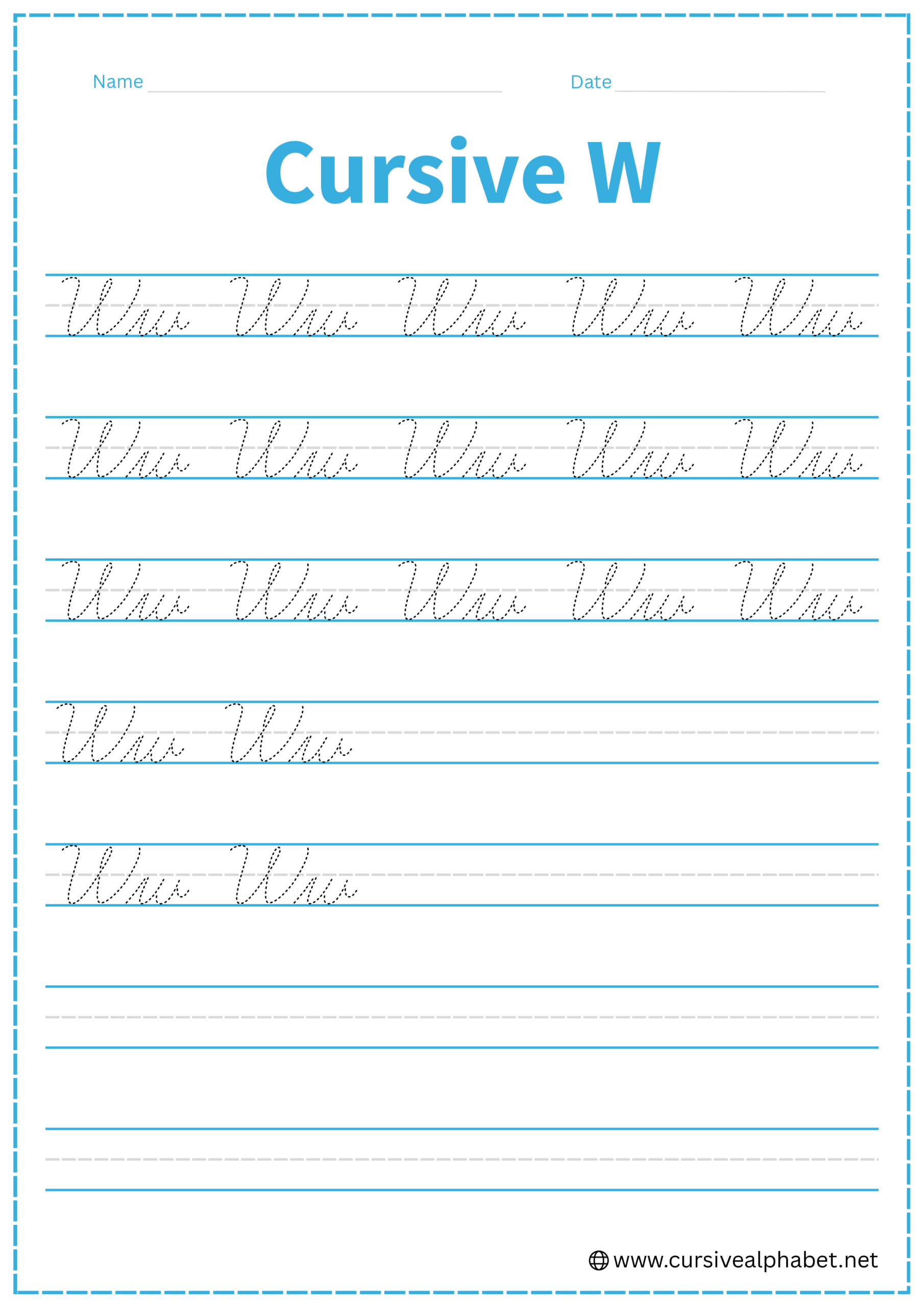
How to Write W in Cursive
The cursive W is essentially with a twist at the end. Like the letters b, v, and o, its most important feature is the high connector (the bridge) at the finish.
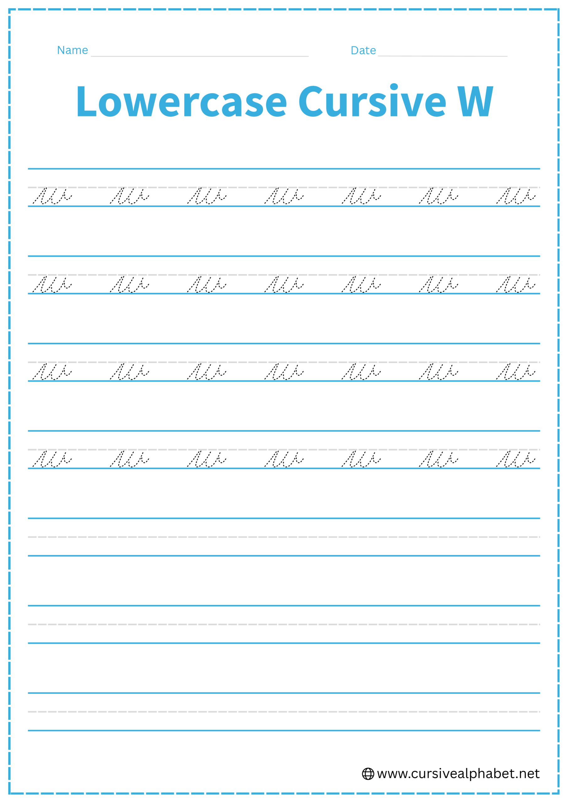
How to Write Lowercase Cursive W
The lowercase w stays between the bottom baseline and the middle dashed line.
- Start on the bottom baseline and slant upward to the middle dashed line.
- Drop straight down to the baseline, curve up to the midline (just like a u).
- Drop straight down again to the baseline, curve back up to the midline.
- Once you hit the midline the second time, do not go back down.
- Finish with a small horizontal “tow-line” to the right to connect to the next letter.
Mistakes to Avoid:
- Dropping to the baseline at the end: If you flick out from the bottom, it will look like two separate us or an i and a u.
- Adding an extra hump: A w has two “valleys” at the bottom. Adding a third makes it a messy, inverted m.
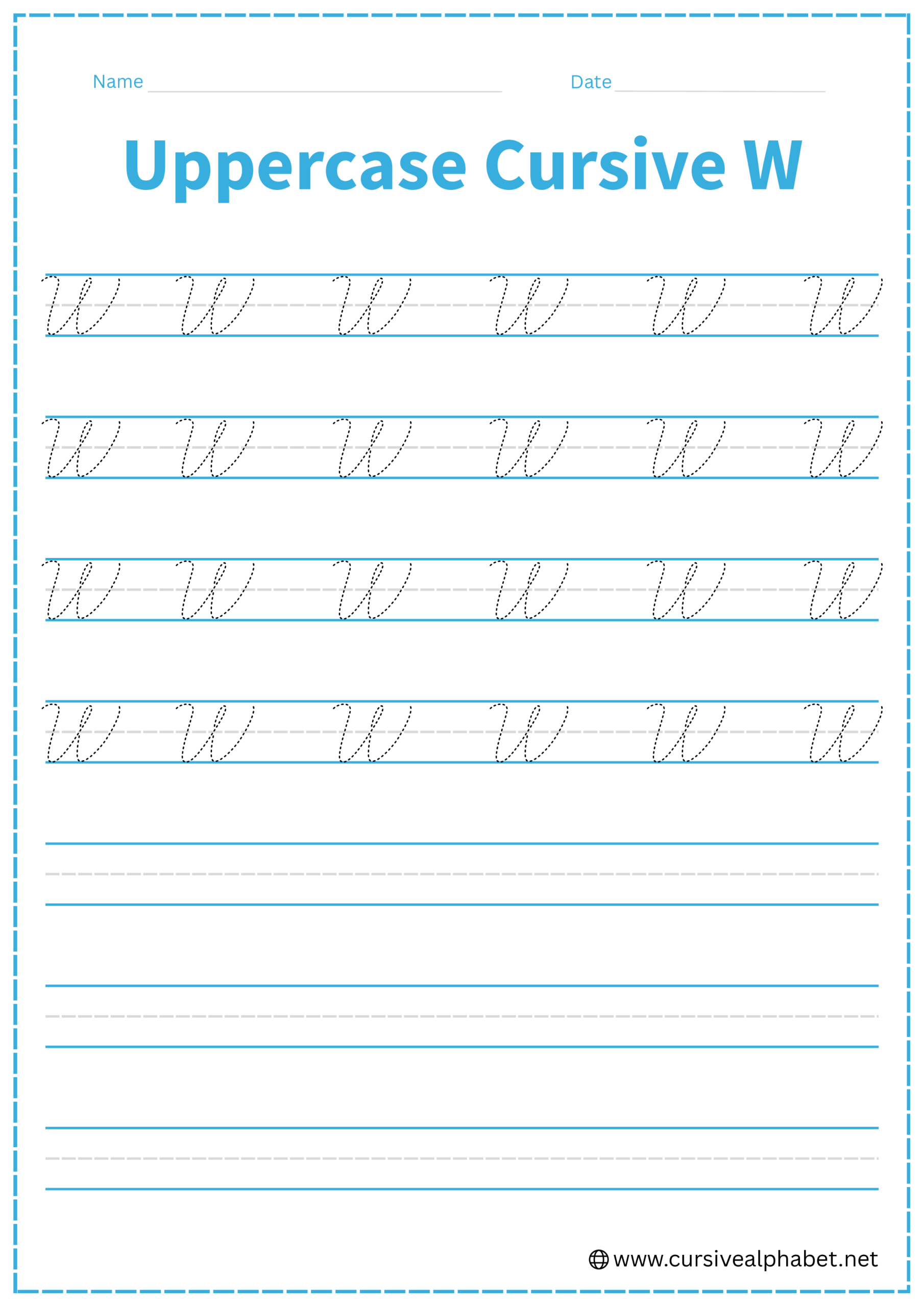
How to Write Uppercase Cursive W
The uppercase W is a large, sweeping letter that fills the space from the baseline to the top line.
- Start near the top line with a small downward hook or “cane” shape.
- Slant all the way down to the bottom baseline, curve wide, and sweep back up to the top line.
- Drop back down to the bottom baseline (following the same slant), curve, and sweep back up to the top line.
- End with a small inward curl or a high horizontal bridge at the top line.
Mistakes to Avoid:
- Making it too pointy: Cursive Ws are generally more rounded at the bottom than printed ones.
- Uneven heights: Both “peaks” of the W should reach the top line.
Frequently Asked Questions
The lowercase w ends at the midline with a small horizontal “bridge” or high connector. Use this bridge to smoothly join the next letter without dropping back to the baseline.
Usually, no. Traditional uppercase W ends at the top line, so you lift your pen and begin the next letter separately. Some modern cursive styles allow a high bridge to connect, but this is optional.
A lowercase w has two “cups” or humps, while a u has only one. The w finishes with a high connector at the midline, whereas the u’s exit stroke flows from the baseline.
Ensure your w only has two humps. Adding a third hump or making the peaks uneven can make it resemble a lowercase m. Keep the humps smooth and consistently slanted.
Uppercase W in cursive should be slightly rounded at the bottom. Avoid making the points too sharp; this keeps the letter elegant and visually distinct from printed W.