Cursive V
On this page, you will get free printable cursive V worksheets and a step-by-step guide on how to write both uppercase and lowercase cursive letter V.
How to Write V in Cursive
The cursive V is a graceful, narrow letter. Much like the letter O, its most important feature is the “high connector” it finishes at the midline rather than dropping back down to the baseline.
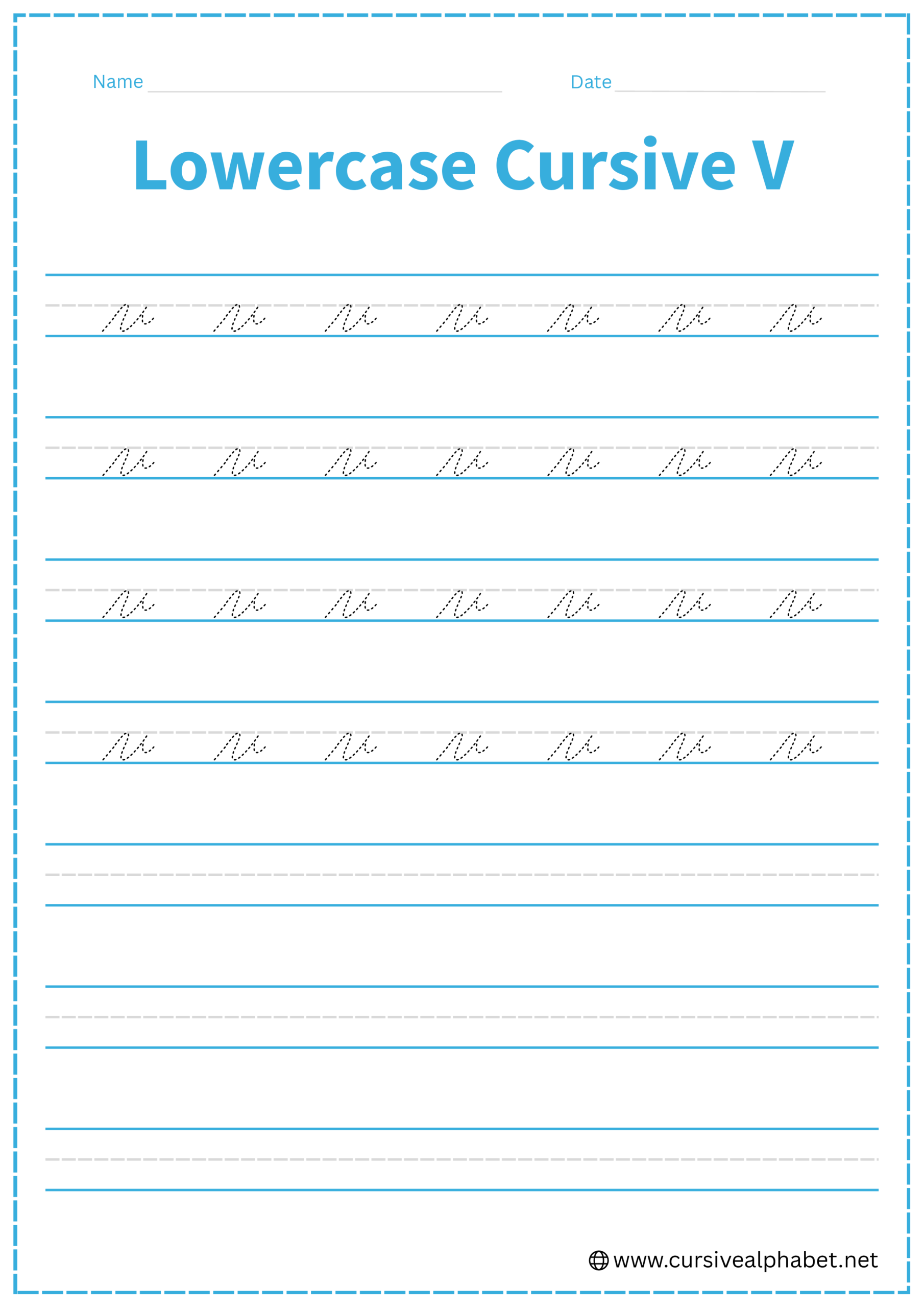
How to Write Lowercase Cursive V
The lowercase v sits between the bottom baseline and the middle dashed line.
- Start on the bottom baseline and curve upward to the middle dashed line.
- Drop down to the bottom baseline with a slight slant, then curve back up to the middle dashed line.
- Once you reach the midline, do not go back down. Instead, finish with a small horizontal “tow-line” or bridge to the right. This is where you connect the next letter.
Mistakes to Avoid:
- Dropping to the baseline: If you add an exit flick at the bottom, your v will look like a u.
- Making it too wide: A v should be slightly narrower and more “pointed” at the bottom than a u.
- Forgetting the bridge: The high connector is essential for cursive legibility.
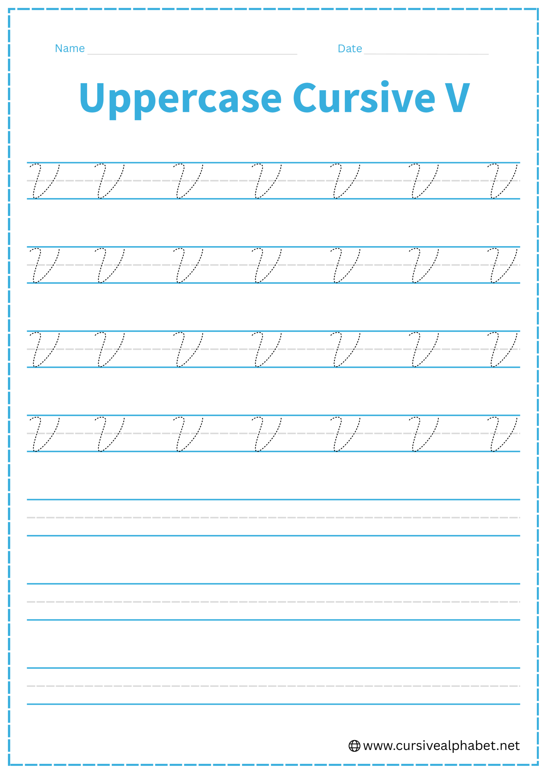
How to Write Uppercase Cursive V
The uppercase V is a large, elegant version of the lowercase letter, often starting with a decorative flourish.
- Start near the top line with a small downward-looping hook (or a “cane” shape) that sweeps into the main descent.
- Draw a slanted line all the way down to the bottom baseline.
- Curve sharply at the bottom and sweep back up to the top line.
- End with a small inward curl or a horizontal bridge at the top line.
Mistakes to Avoid:
- Rounding the bottom too much: While it isn’t a sharp “V” like print, it should be narrower than an uppercase U.
- Connecting at the bottom: Like the lowercase version, the uppercase V usually connects (if at all) from the top.
Frequently Asked Questions
In most traditional cursive styles, the uppercase V does not connect. The pen finishes at the top line, and you lift it to start the next letter. Some modern scripts allow a bridge down from the top to connect, but this is optional.
The lowercase v ends at the middle dashed line with a “high bridge” or horizontal tow-line. To connect to letters like e or i, flow directly into the top of the next letter without returning to the baseline.
A lowercase b starts with a tall loop reaching the top line, while a v stays below the middle dashed line. Both letters use a slanted stroke, but the exit bridge of the v is at the midline, not the top.
If you drop the exit stroke back to the baseline, your v can resemble a u. Keep the bridge in the middle line to maintain the proper V shape.
Cursive uppercase V should have a gentle curve at the bottom, slightly narrower than a U. It should not be perfectly pointed like a printed V, nor too rounded like a U.