Cursive U
The cursive letter U helps you write smoothly and elegantly. This guide shows you how to write both the big ‘U’ and the small ‘u,’ step by step. You can also download our free printable worksheets to trace and practice writing the cursive letter U on your own.

How to Write U in Cursive
The cursive U is a fluid, rhythmic letter that serves as the foundation for other letters like V, W, and Y. It is essentially a series of “under-curves” or cups.
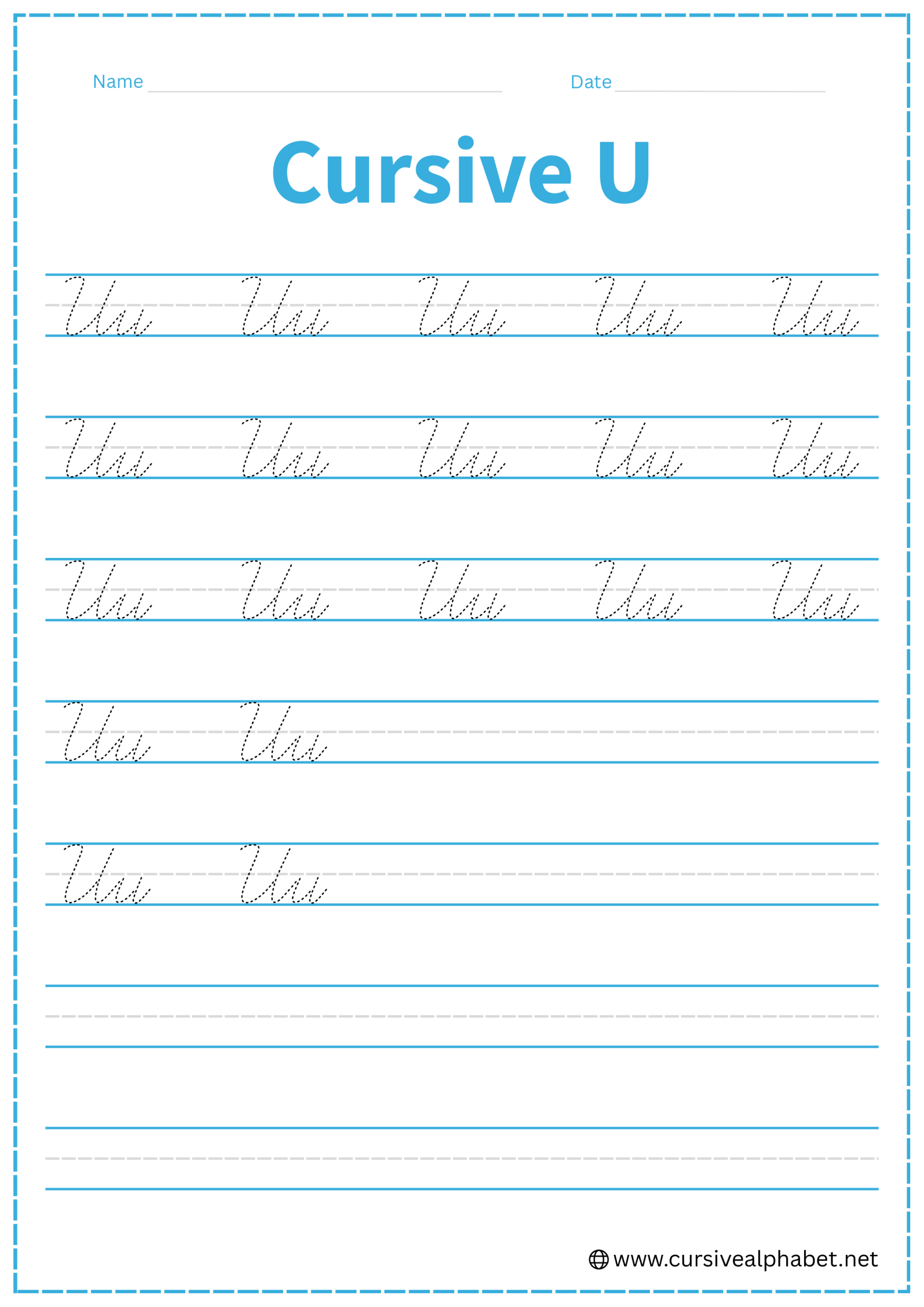
How to Write Lowercase Cursive U
The lowercase u stays entirely between the bottom baseline and the middle dashed line.
- Start on the bottom baseline and slant upward to the middle dashed line.
- Drop straight back down to the bottom baseline, curve smoothly to the right, and head back up to the middle dashed line.
- Retrace your second upward stroke back down to the bottom baseline.
- Curve away to the right with a flick toward the midline to connect to the next letter.
Mistakes to Avoid:
- Rounding the bottom too much: While it is a “cup” shape, the downward strokes should be relatively straight and slanted.
- Lifting the pen: The u should be one continuous motion down, up, down, flick.
- Forgetting the retrace: If you don’t retrace the second stem, the letter ends up looking like a wide, messy loop.
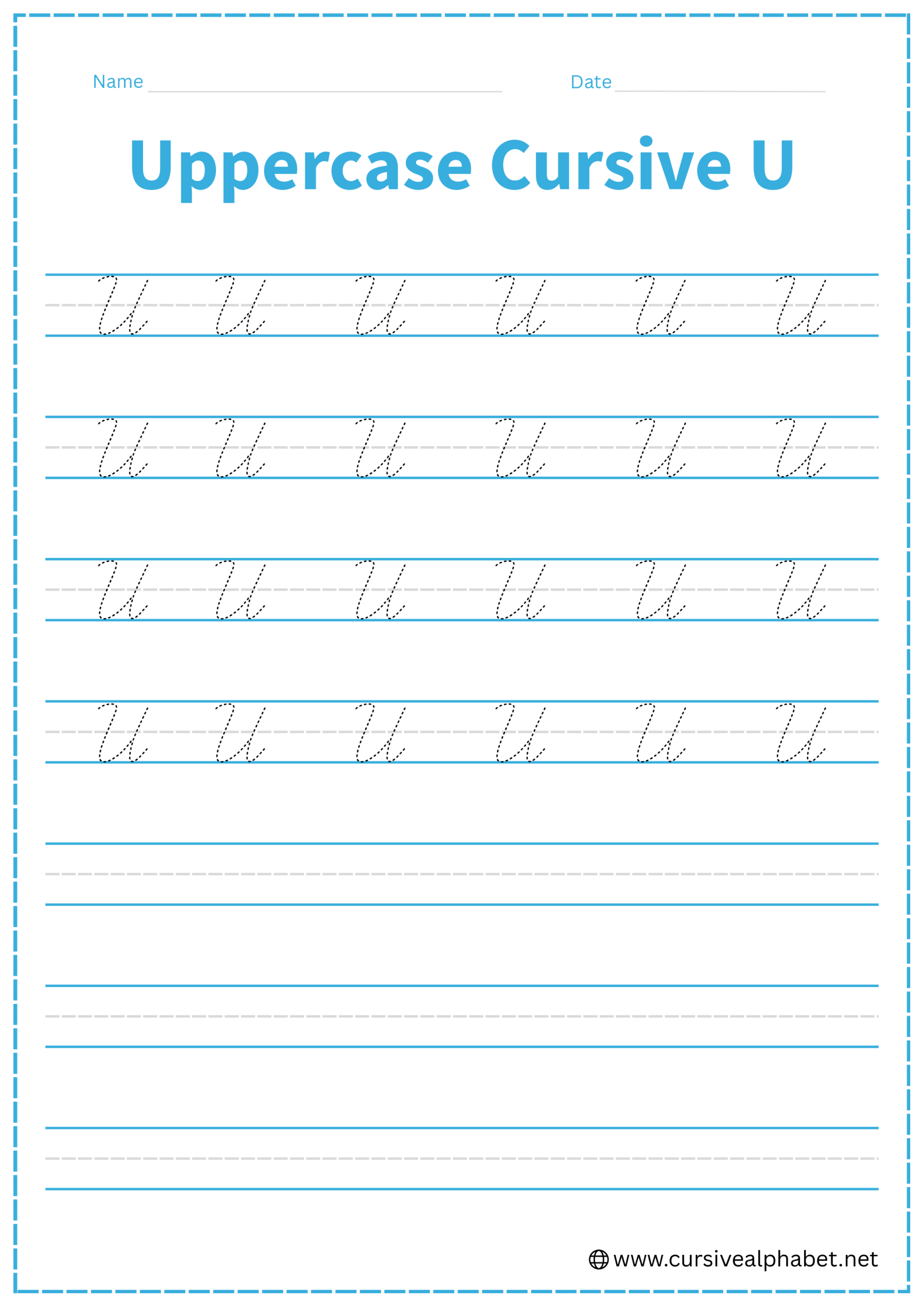
How to Write Uppercase Cursive U
The uppercase U is a larger, more dramatic version of the lowercase letter, filling the space between the baseline and the top line.
- Start near the top line with a small downward hook or curve that leads into the first big drop.
- Slant down to the bottom baseline, curve broadly to the right, and sweep back up to the top line.
- Retrace that upward stroke straight back down to the bottom baseline.
- Finish with a flick to the right to join the next lowercase letter.
Mistakes to Avoid:
- Confusing it with “V”: A cursive U is rounded at the bottom and has a tail on the baseline. A cursive V is usually narrower and ends with a “bridge” at the top.
- Stopping at the middle line: Make sure the uppercase version reaches the top line on both the first and second peaks.
Frequently Asked Questions
Yes! The exit stroke at the bottom baseline naturally flows into the next letter, allowing smooth transitions in words like “Under” or “Uncle.”
A lowercase u has two rounded peaks, while a lowercase w has an extra peak or bridge at the end. Counting the peaks helps avoid confusion.
If the downward strokes are disconnected or have added marks, it can resemble two i’s. Ensure a smooth, continuous curve to form a proper U.
Yes! The entire letter should flow from the first upstroke, down through the cups, and finish with the exit flick, without lifting your pen.
It can be. Remember, a cursive U is rounded at the bottom with a small connecting tail, while a V is narrower and more pointed, often with no baseline flick.
Start near the top line with a small entry hook, curve down to the bottom baseline, then sweep back up to the top line and finish with a rightward exit flick.