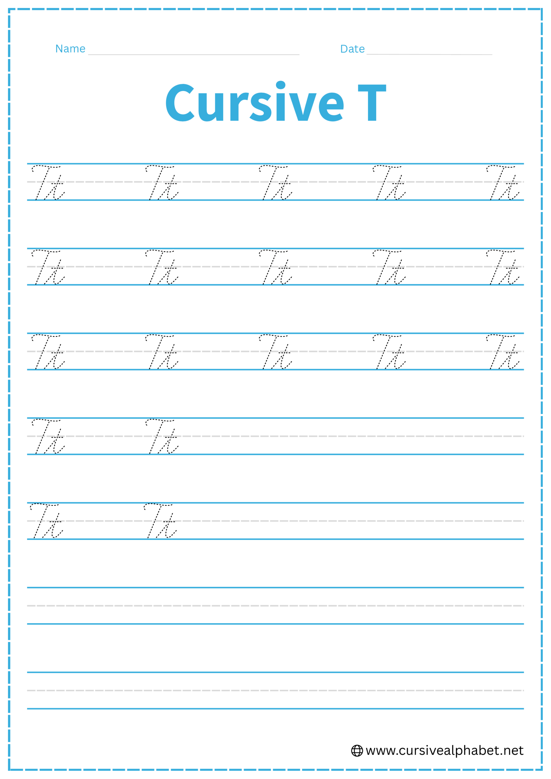
Cursive T
Cursive T helps you write neat, flowing letters with strong strokes. This page teaches both uppercase and lowercase T with step-by-step instructions and provides free printable worksheets to practice.
How to Write T in Cursive
The cursive T is one of the most frequently used letters. While the lowercase version is famous for its “cross,” the uppercase version is known for its elegant, wavy “hat.”
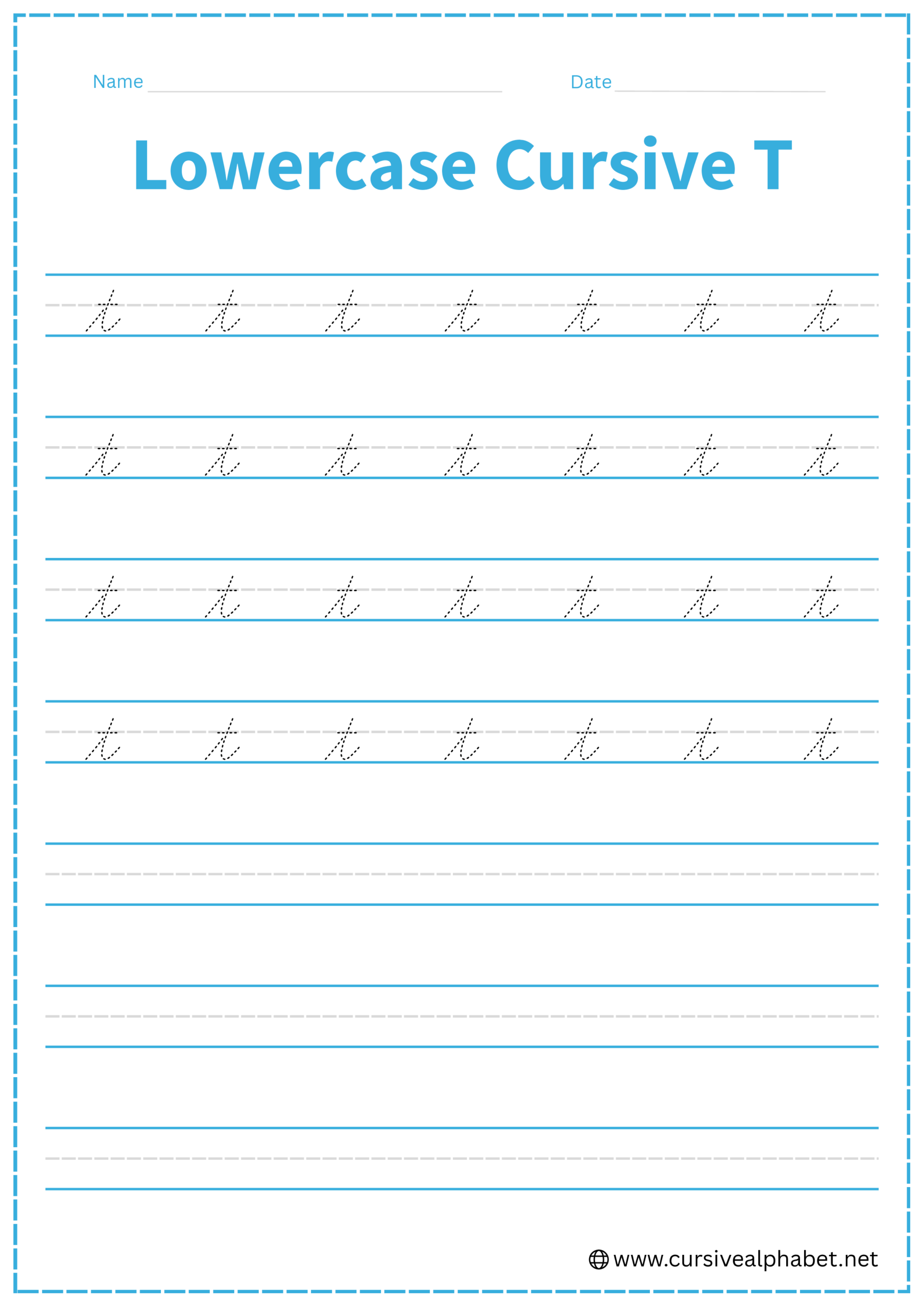
How to Write Lowercase Cursive T
The lowercase t is a tall letter, but in many styles, it doesn’t quite reach the very top line; it usually sits just a bit below it.
- Start on the bottom baseline and sweep upward to nearly the top line.
- Move your pen straight back down the same line you just drew, just like a lowercase i.
- Curve away from the stem at the bottom baseline and flick upward to the right.
- Lift your pen and draw a short, straight horizontal line across the stem at the middle dashed line.
Mistakes to Avoid:
- Looping the stem: Just like the i, the t should be retraced. If you leave a loop, it looks like an l.
- Crossing too high or low: Aim for the middle dashed line to keep it balanced.
- Forgetting the cross: Without the horizontal bar, it’s just a very tall I.
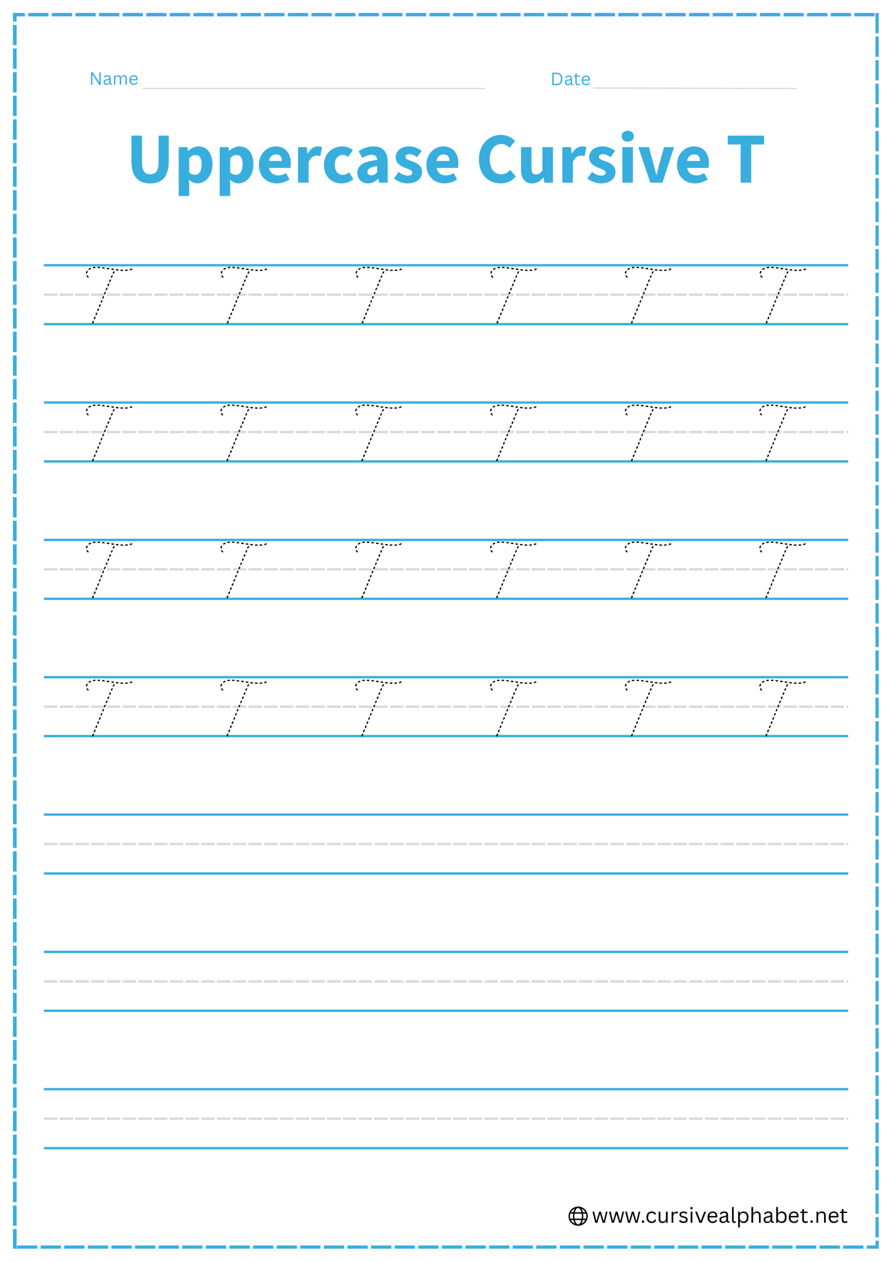
How to Write Uppercase Cursive T
The uppercase T is unique because it is often written without the pen ever touching the vertical stem. It looks very similar to an uppercase F, but without the middle crossbar.
- Start just below the top line. Draw a small wave or “S” curve horizontally.
- Lift your pen (or move to the center of the wave) and start a second stroke.
- Draw a slanted vertical line from the middle of the “hat” down to the bottom baseline.
- Finish with a graceful curl to the left as it sits on the baseline.
Mistakes to Avoid:
- Crossing the stem: If you add a small horizontal line in the middle of the vertical stem, you have written an F, not a T.
- Connecting the hat to the stem: In many formal styles, the top “hat” floats slightly above the stem.
- Making it too straight: Cursive is all about the slant; ensure the vertical stem leans slightly to the right.
Frequently Asked Questions
In most traditional cursive styles, no. The leftward curl at the baseline is decorative, so you lift your pen and start the next letter separately.
Follow the cursive “Golden Rule”: write the entire word first, then go back to cross all your t’s (and dot your i’s). This ensures smooth, consistent writing.
The F has a small crossbar in the middle of its stem, whereas the T does not. Also, the T’s vertical line usually leans slightly to the right.
Lowercase t usually sits just below the top line of your three-lined paper. It should reach above the middle dashed line, but doesn’t need to touch the top line.
Some modern cursive styles allow a connecting stroke from the base curl, but traditionally, the uppercase T is written as a standalone letter.
The retrace ensures a smooth, continuous stroke and prevents the stem from looping incorrectly. It also differentiates t from l in flowing handwriting.