Cursive S
Cursive S helps you write smooth, flowing, and elegant letters. This page teaches both uppercase and lowercase S with easy step-by-step instructions. Download free printable worksheets to practice tracing and writing S for neat, connected handwriting.
How to Write S in Cursive
The cursive S is one of the most distinctive letters in the alphabet because it looks significantly different from its printed counterpart. Both versions are built on a strong, slanted upward stroke.
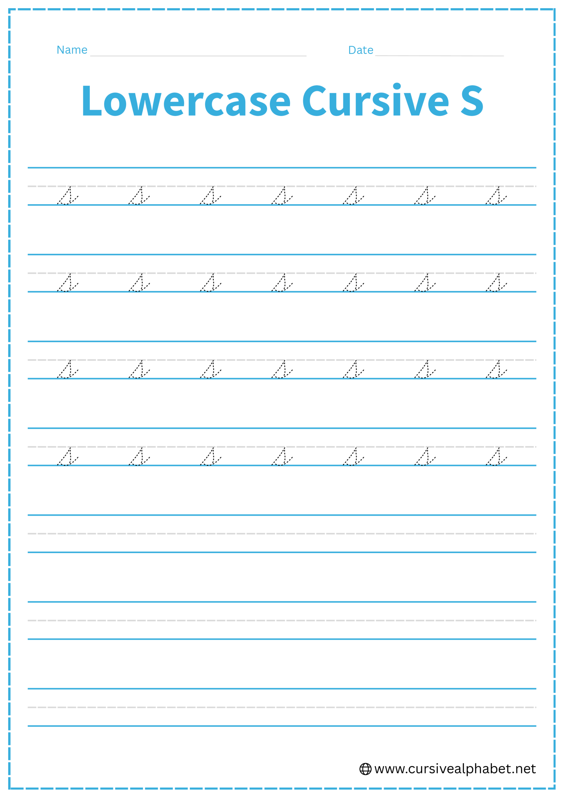
How to Write Lowercase Cursive S
The lowercase s stays between the bottom baseline and the middle dashed line.
- Start on the bottom baseline and sweep up at a slant to the middle dashed line.
- Curve back down to the right, creating a rounded “belly” that touches the bottom baseline.
- Continue the curve back toward your initial upstroke until they meet or nearly touch.
- Retrace a tiny bit of that bottom curve and flick out to the right to connect to the next letter.
Mistakes to Avoid:
- Leaving the belly open: If the bottom doesn’t tuck back toward the start, it can look like a lowercase r.
- Making it too round: It should maintain a slanted, aerodynamic shape rather than being a perfect circle.
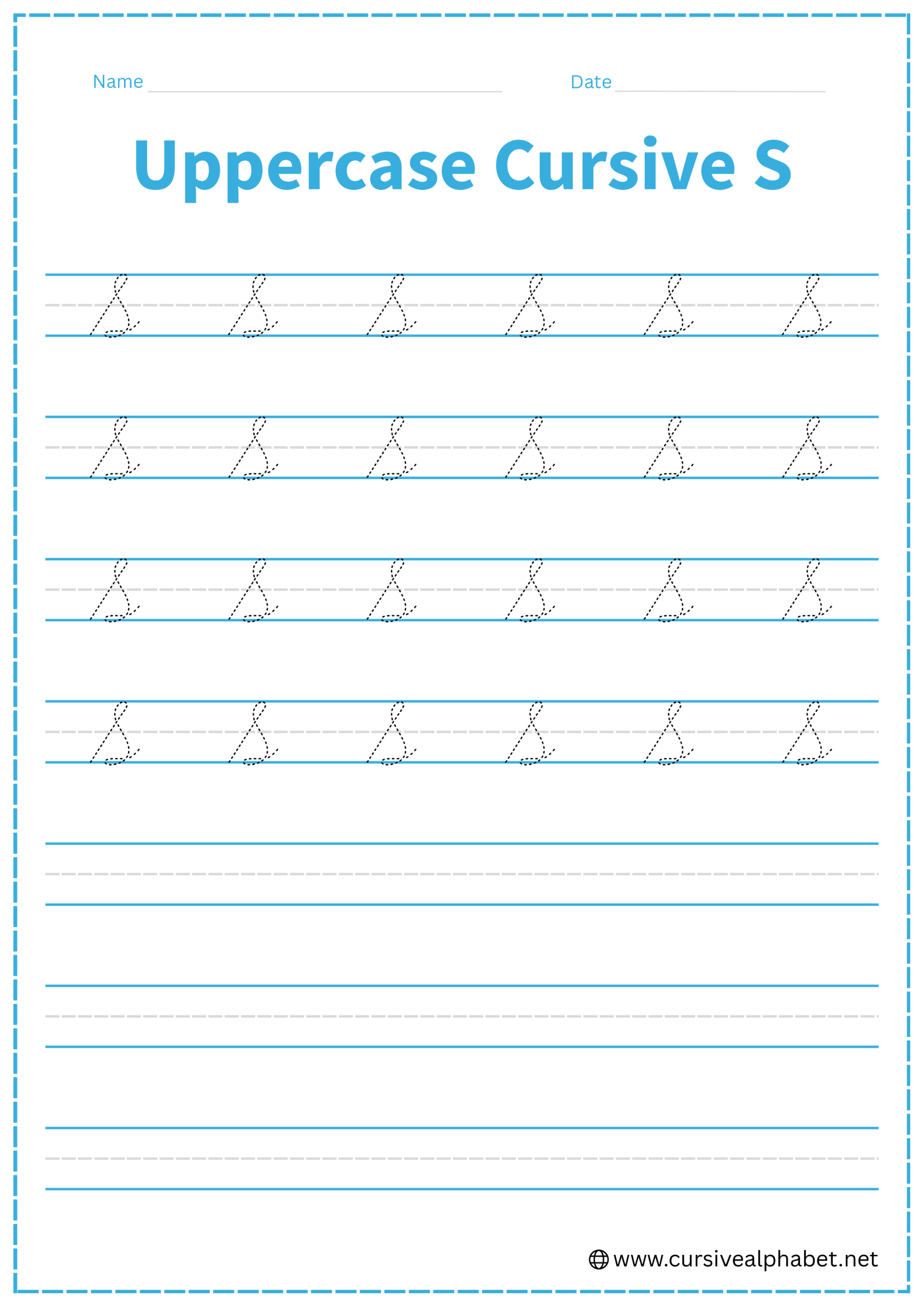
How to Write Uppercase Cursive S
The uppercase S is a large, flowing letter that fills the entire space from the baseline to the top line.
- Start at the bottom baseline and draw a long, slanted line all the way to the top line.
- At the top, make a small, narrow loop to the left (like the top of an L or G).
- Sweep down and to the right in a large, graceful arc that touches the bottom baseline.
- Bring the curve back in to cross or touch the initial upstroke.
- Finish with a small flick or “boat” stroke to the right to connect.
Mistakes to Avoid:
- Making the top loop too big: If the top loop is too wide, it can be confused with an uppercase G.
- Starting at the top: Remember, like many uppercase cursive letters, the S begins its journey at the bottom baseline.
Frequently Asked Questions
Use the exit flick at the end of the belly. This small, angled stroke points toward the middle dashed line to smoothly join the next letter.
Yes! Most cursive styles allow the uppercase S to connect. The final flick or “boat stroke” at the baseline naturally flows into the following lowercase letter.
Check the baseline. A lowercase s stays entirely above the baseline, while a p descends below it. Also, ensure the belly loops back slightly toward the initial stroke.
No. In cursive, both uppercase and lowercase S should have a slight rightward slant and aerodynamic shape. Perfectly round loops make the letters look printed, not cursive.
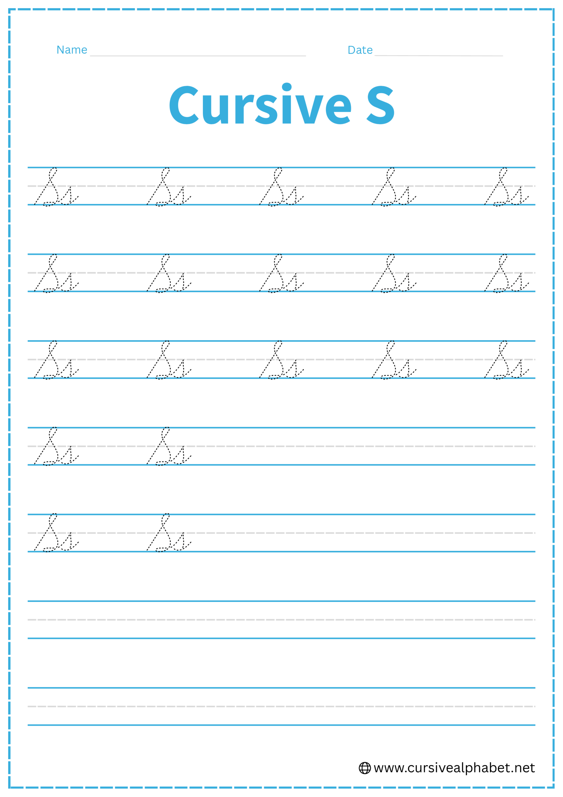
Uppercase cursive S spans from baseline to top line with a large flowing curve, while lowercase s is smaller, sitting between the baseline and middle dashed line with a compact belly.
Yes! Both uppercase and lowercase cursive S are ideally written in a single, smooth movement. The key is maintaining a consistent slant and flowing curves for elegance and readability.