Cursive R
Cursive R helps improve handwriting flow and style. This page provides step-by-step instructions for writing both uppercase and lowercase R. Download free worksheets to practice neat, flowing, and connected letters.
How to Write R in Cursive
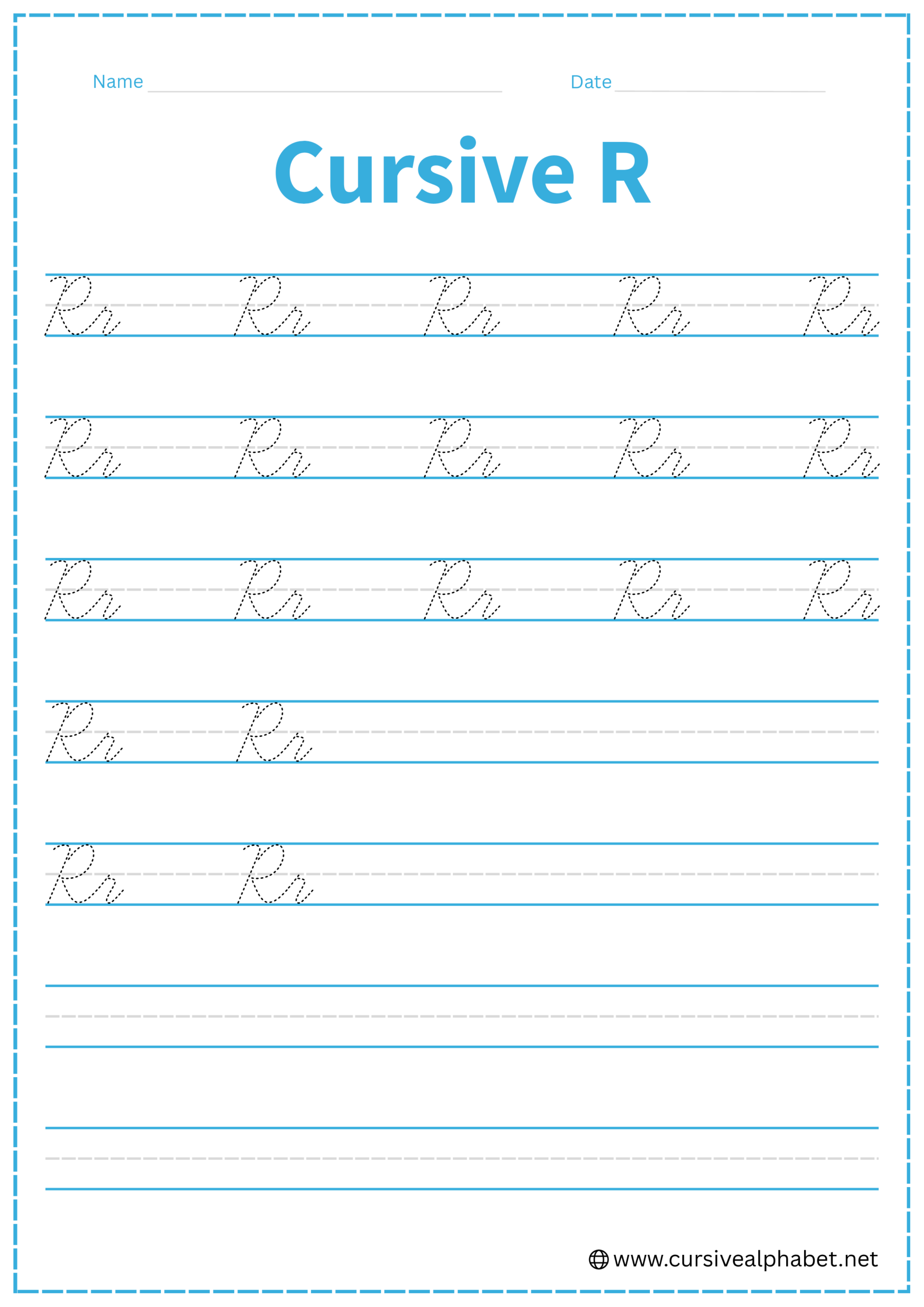
The cursive R is a letter that requires a bit of control. The lowercase version is famous for its “shoulder,” while the uppercase version is one of the most decorative letters in the alphabet.
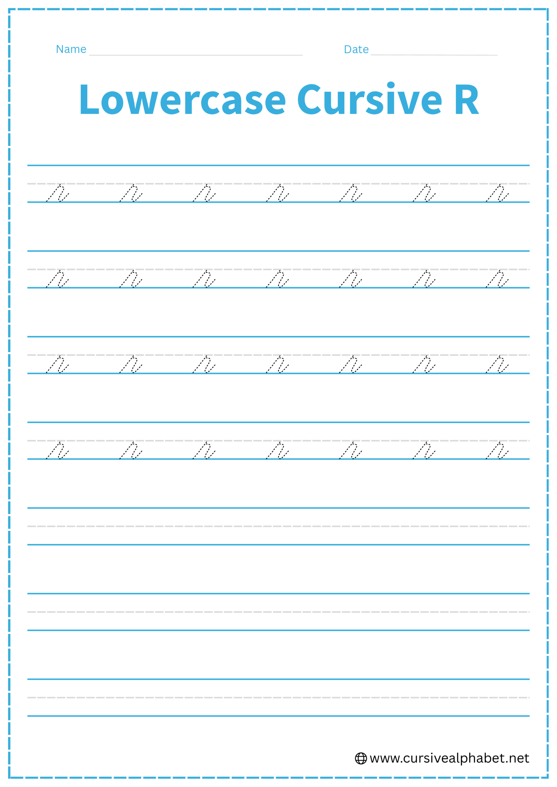
How to Write Lowercase Cursive R
The lowercase r stays entirely between the bottom baseline and the middle dashed line. It has a unique “shelf” that distinguishes it from other letters.
- Start on the bottom baseline and sweep up to the middle dashed line.
- Once you hit the midline, make a tiny “step” or a very small loop to the right. This creates a flat “shelf” or “shoulder.”
- From the end of that shelf, drop down to the bottom baseline with a slight curve.
- Finish with a small upward flick toward the middle dashed line.
Mistakes to Avoid:
- Making the shoulder too wide: It should be a small horizontal step, not a long bridge.
- Rounding the top too much: If you round it like a hump, it will look like an n.
- Forgetting the shelf: A straight up-and-down motion will make it look like an i without a dot.
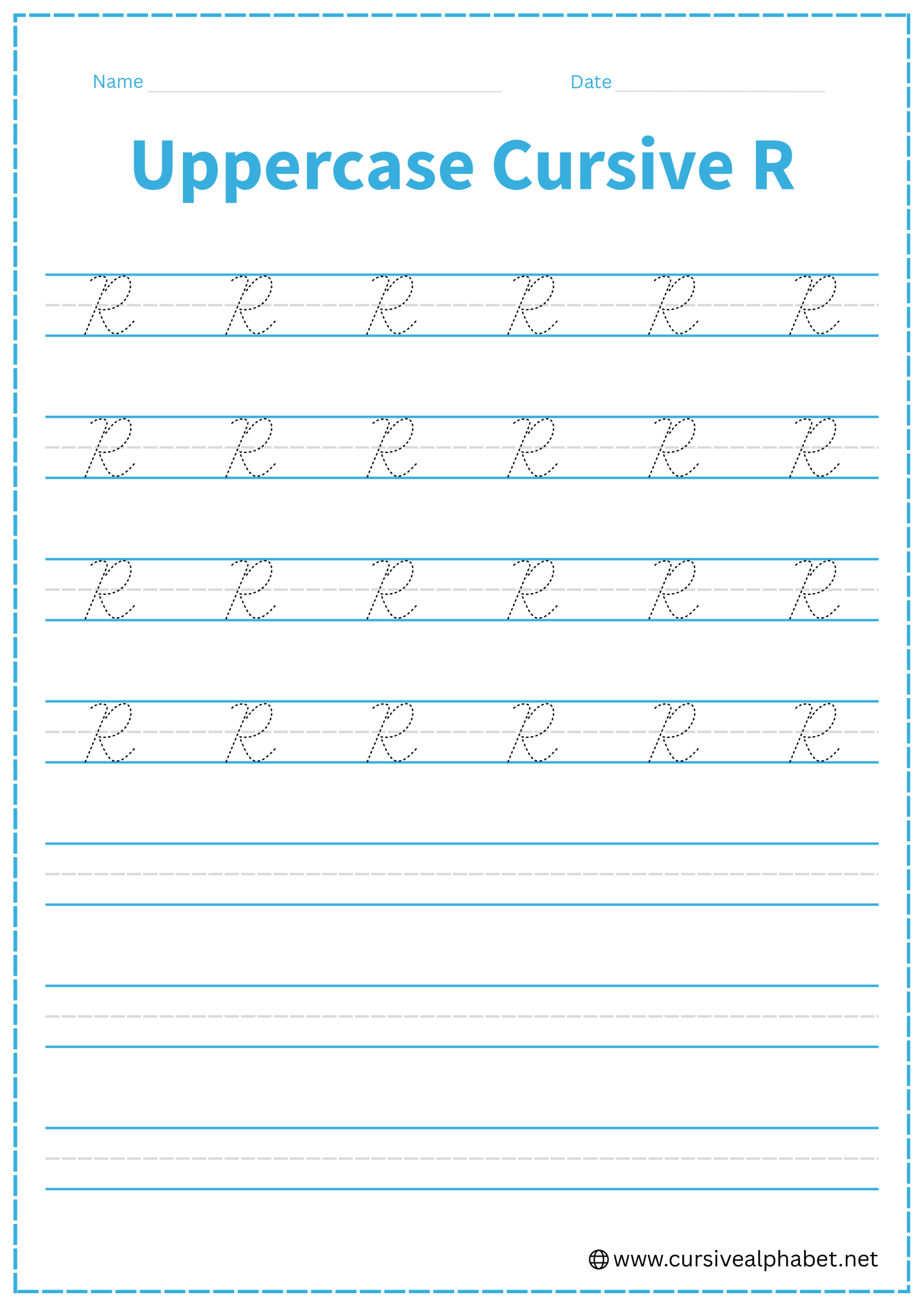
How to Write Uppercase Cursive R
The uppercase R starts very much like a cursive P, but it adds a “leg” at the end to stand on.
- Start at the top line and draw a slanted line down to the bottom baseline, finishing with a small curl to the left.
- Lift your pen and start back at the top line. Sweep out to the right in a wide, rounded curve.
- Bring the curve in to touch the stem at the middle dashed line, making a tiny loop (a “knot”) where they meet.
- From that middle knot, “kick” out to the right down to the bottom baseline.
- Finish with a graceful curve upward to connect to the next letter.
Mistakes to Avoid:
- Forgetting the middle knot: That tiny loop helps the transition from the cap to the leg look smooth.
- Connecting the leg too low: The leg should start at the middle dashed line, not near the bottom.
Frequently Asked Questions
Yes! The exit stroke from the “leg” naturally flows into the next lowercase letter, making cursive writing smooth and connected.
When connecting from letters like o, v, or w, draw the bridge directly into the “shoulder” of the r. Avoid dropping down to the baseline, which breaks the flow.
This usually happens when the top “shoulder” is rounded too much. Make sure the r has a small, flat horizontal shelf at the top-right corner.
No. Keep it as a continuous stroke. Lifting the pen can make the letter look disconnected and uneven.
Uppercase cursive R starts like a P with a stem and rounded cap, but it adds a “leg” from the middle to the bottom, giving it a distinctive appearance.
Yes. The small loop where the cap meets the stem ensures the leg flows smoothly and makes the letter look elegant.