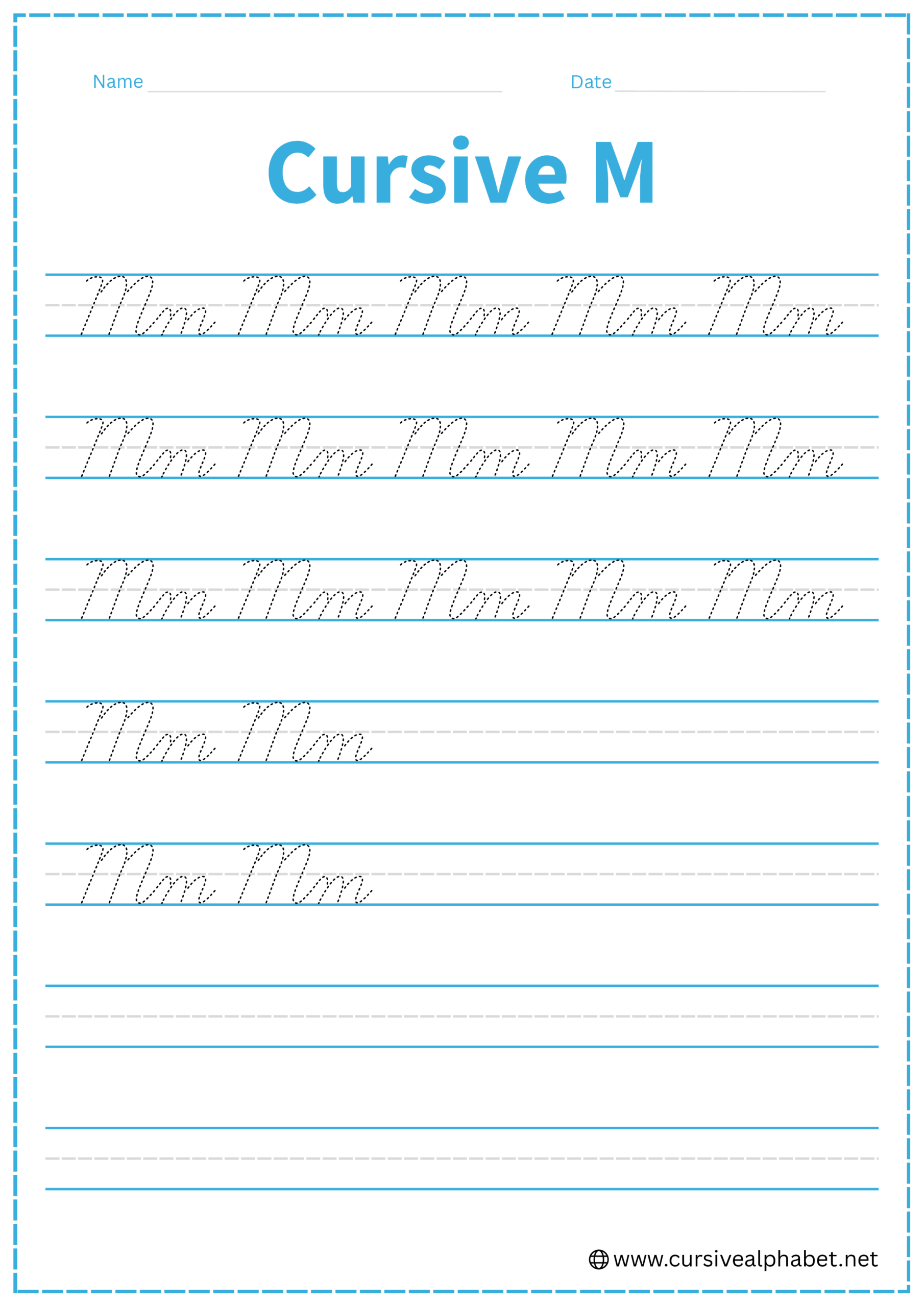
Cursive M
Improve your handwriting with cursive M. This page teaches step-by-step how to write uppercase and lowercase M and provides worksheets to help you practice neat, flowing letters.
How to Write M in Cursive
The cursive M is all about rhythm. Whether you are writing the three-humped uppercase version or the two-humped lowercase version, the key is keeping your “mountains” even and slanted.
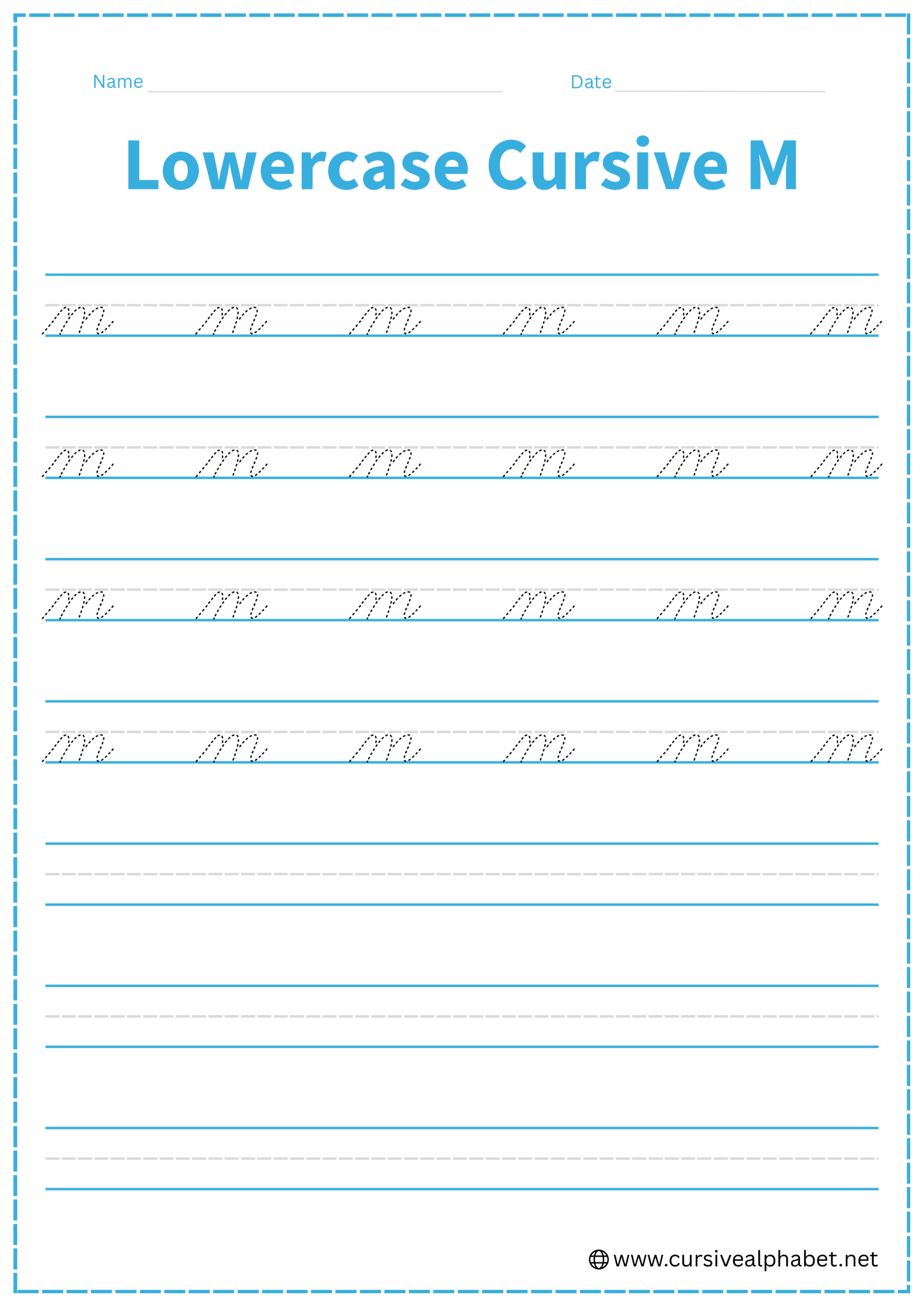
How to Write Lowercase Cursive M
In cursive, the lowercase m actually has three downward strokes (or “humps”), which is one more than the printed version.
- Start at the bottom baseline and curve up to the middle dashed line.
- Curve over to the right and drop a straight line down to the bottom baseline.
- Retrace back up that same line to the middle dashed line, curve over, and drop down again.
- Retrace up one last time to the middle dashed line, curve over, and drop to the bottom baseline.
- Finish with a small upward flick to connect to the next letter.
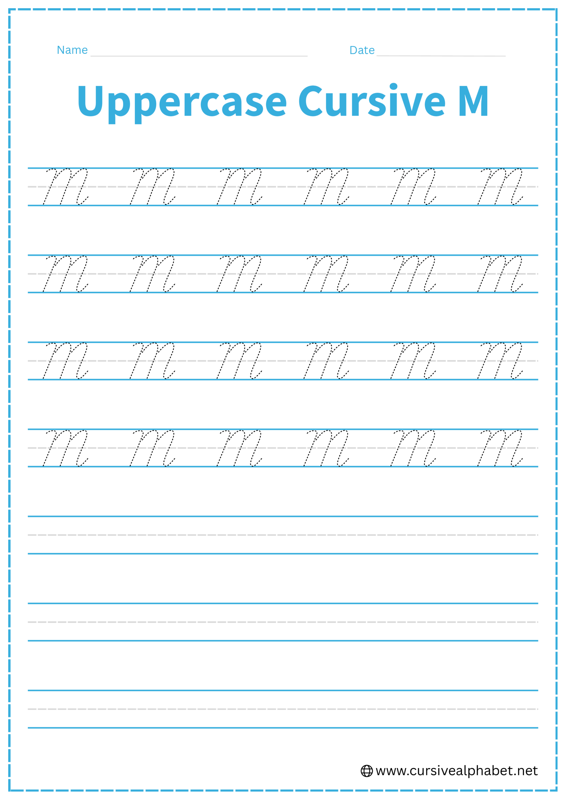
How to Write Uppercase Cursive M
The uppercase M is large, elegant, and takes up the full space from the baseline to the top line.
- Start at the bottom baseline with a small hook or curve that sweeps up to the top line.
- Drop a slanted line all the way back down to the bottom baseline.
- Retrace or sweep back up to the top line.
- Drop down to the bottom baseline one last time.
- Finish with an upward curve to the right to connect to the next letter.
Common Mistakes to Avoid
Lowercase Cursive M
- Writing only two humps: In cursive, an m with two humps is actually an n.
- Lifting your pen: The entire letter should be one continuous, flowing movement.
- Uneven heights: Ensure all three humps touch the middle dashed line.
Uppercase Cursive M
- Making it too pointy: Cursive Ms should be slightly rounded at the tops, not sharp like a printed M.
- Stopping at the middle line: All peaks of the uppercase M should reach the top line.
- Crowding the letter: Give the “legs” enough space so the letter doesn’t look like a squished zig-zag.
Frequently Asked Questions
The first stroke is actually the “entry stroke” from the previous letter. To make the letter recognizable as an m, you need those three distinct downward motions.
Yes, the final upward flick on the baseline is designed to lead directly into the next lowercase letter.
Remember that m is rounded at the top (on the middle line), while w is rounded/pointed at the bottom (on the baseline).
In cursive, the lowercase m includes three humps to maintain flow and distinguish it from n or other letters. The extra stroke ensures smooth, connected writing.
Yes! The final upward flick at the baseline is designed to flow directly into the next lowercase letter, keeping your handwriting continuous and elegant.
Focus on the placement of the humps: m’s arches peak at the middle dashed line, while w’s arches sit closer to the baseline. Also, keep strokes smooth and flowing.
Avoid making the peaks too pointy, stopping mid-height, uneven humps, or lifting your pen mid-letter. Ensure continuous motion and even slant for neatness.
Yes! Free printable worksheets let you trace and write both uppercase and lowercase M to improve rhythm, spacing, and overall handwriting consistency.
Short daily sessions work best. Focus on keeping humps even, maintaining smooth slanted strokes, and practicing the exit flick for continuous cursive writing.