Cursive L
Cursive L is an essential letter for smooth, flowing handwriting. Learn to write both uppercase and lowercase L with step-by-step instructions and free printable practice worksheets.
How to Write L in Cursive
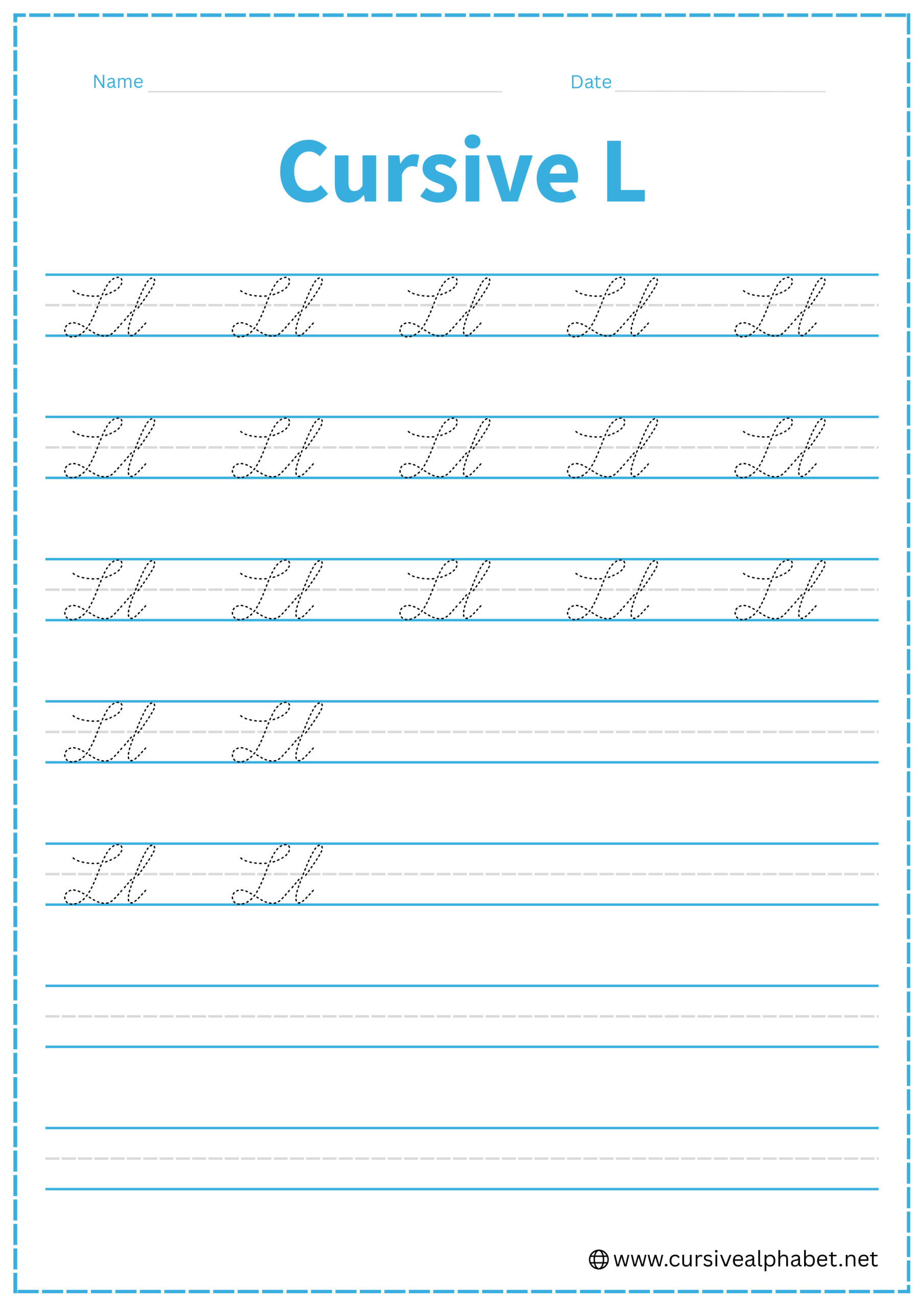
The letter L is one of the most satisfying cursive letters to write because of its smooth, continuous loops. Both the uppercase and lowercase versions are “tall” letters that reach the very top line.
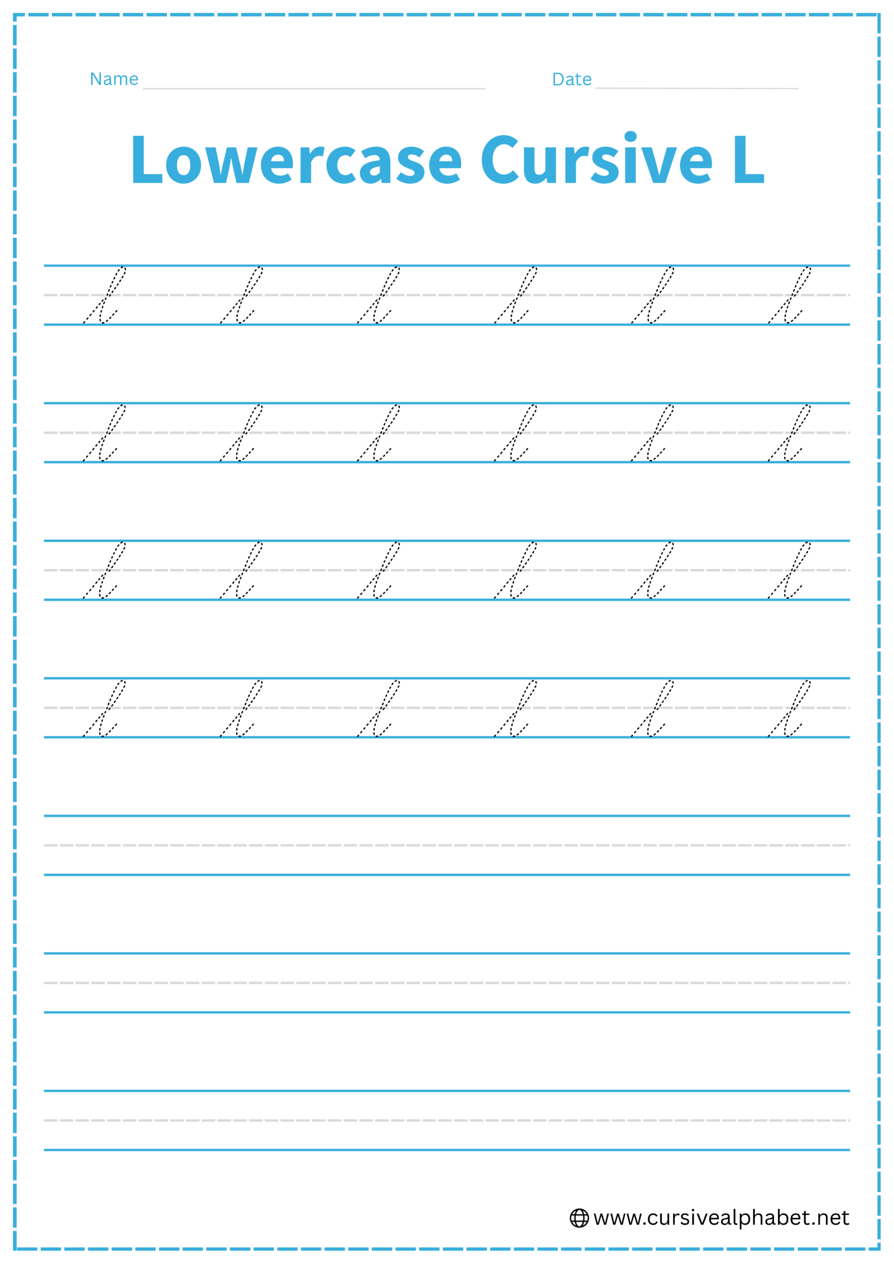
How to Write Lowercase Cursive L
The lowercase l is the foundation for many other letters (like b, f, h, and k).
- Start on the bottom baseline and sweep upward at a sharp slant all the way to the top line.
- Curve gently to the left and pull a straight, slanted line back down toward the bottom baseline.
- Your downward stroke should cross your upward stroke right at the middle dashed line.
- As you hit the bottom line, curve back up to the right to create a connector flick.
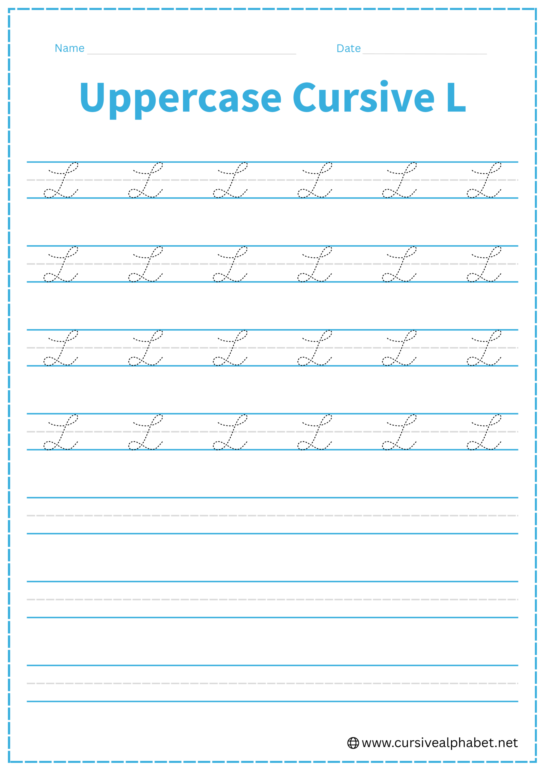
How to Write Uppercase Cursive L
The uppercase L is famous for its “double loop”—one at the top and one at the bottom.
- Start slightly below the top line, curve up to touch it, and loop around to the left.
- Pull a long, elegant slanted line down toward the bottom baseline.
- Before hitting the baseline, curve to the left and make a small, flat loop that sits right on the bottom line.
- Finish by pulling the stroke to the right in a soft “wave” that dips slightly below the baseline and then comes back up.
Common Mistakes to Avoid
Lowercase Cursive L
- Making it too skinny: If there’s no “white space” in the loop, it looks like a straight line or a slanted i.
- Stopping at the middle line: It must reach the top line to be an l.
- Making the loop too fat: This can make it look like a wide e.
Uppercase Cursive L
- Starting at the bottom: Unlike the lowercase version, the uppercase L starts at the top.
- Making the bottom loop too round: It should be a flat, horizontal loop to keep the letter stable.
- Forgetting the exit wave: This is how the L connects to the next letter.
Frequently Asked Questions
Yes! The “wave” at the end of the uppercase L serves as a perfect connector to the next lowercase letter.
Height is the only difference. An e stays below the middle dashed line, while an l must reach the top line.
No. In cursive, the stem should have a slight rightward slant (usually about 60 degrees to 70 degrees relative to the baseline).
Start with a smooth upward stroke from the baseline to the top line, form a gentle loop, pull back down, and finish with a small flick to connect to the next letter.
Lowercase l reaches the top line, while lowercase e stays between the middle and bottom lines. This height difference helps distinguish the letters in cursive.
Yes! The horizontal “wave” at the end of the uppercase L is designed to flow smoothly into the next lowercase letter in cursive writing.
No. The stem should have a slight rightward slant to create a natural, flowing cursive style. Too vertical or too slanted can affect consistency.
Avoid making loops too skinny or too wide, stopping the lowercase l before the top line, starting the uppercase L at the bottom, or skipping the exit wave that connects letters.
Yes! Free printable worksheets let you trace and write both uppercase and lowercase L to improve stroke control, spacing, and overall handwriting consistency.