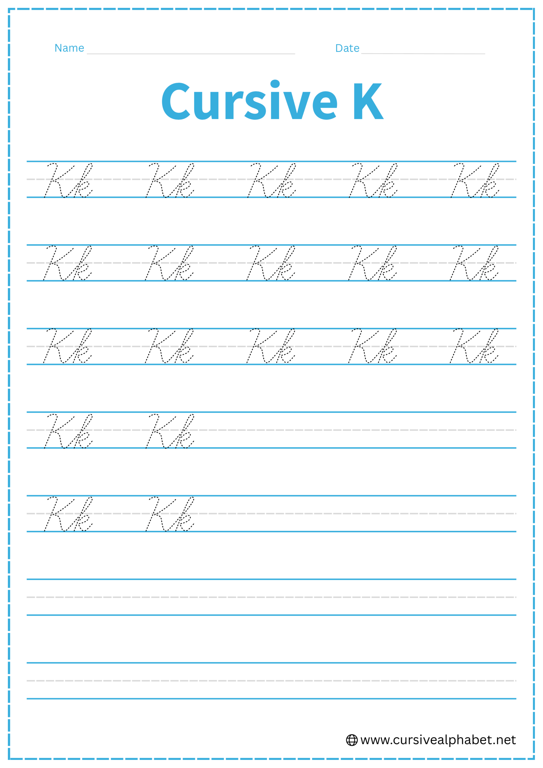
Cursive K
Learning cursive K helps you improve handwriting flow and consistency. On this page, you’ll find step-by-step instructions for writing both uppercase and lowercase K. Download free printable worksheets to trace and practice the letter K, helping you write smoothly and neatly.
How to Write K in Cursive
The cursive K is often considered one of the most challenging letters because of its unique “loops and kicks.” It requires a bit of precision to keep it from looking like an H or an R.
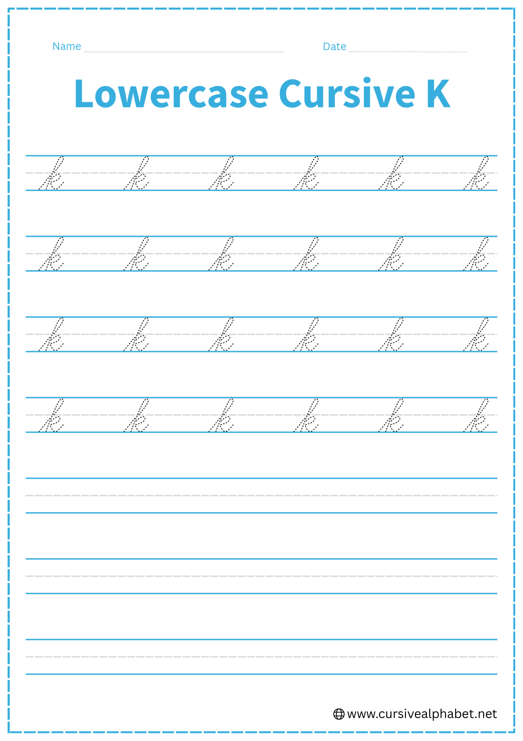
How to Write Lowercase Cursive K
The lowercase k is a tall letter that reaches the top line.
- Start on the bottom baseline and sweep up to the top line (just like an L or h).
- Curve to the left and pull a straight line back down to the bottom baseline.
- Retrace back up the stem to the middle dashed line. Curve forward and tuck back in toward the stem to form a small, round “bubble.”
- From that center tuck, slantedly “kick” out to the right down to the bottom baseline.
- Finish with a small upward flick toward the middle dashed line.
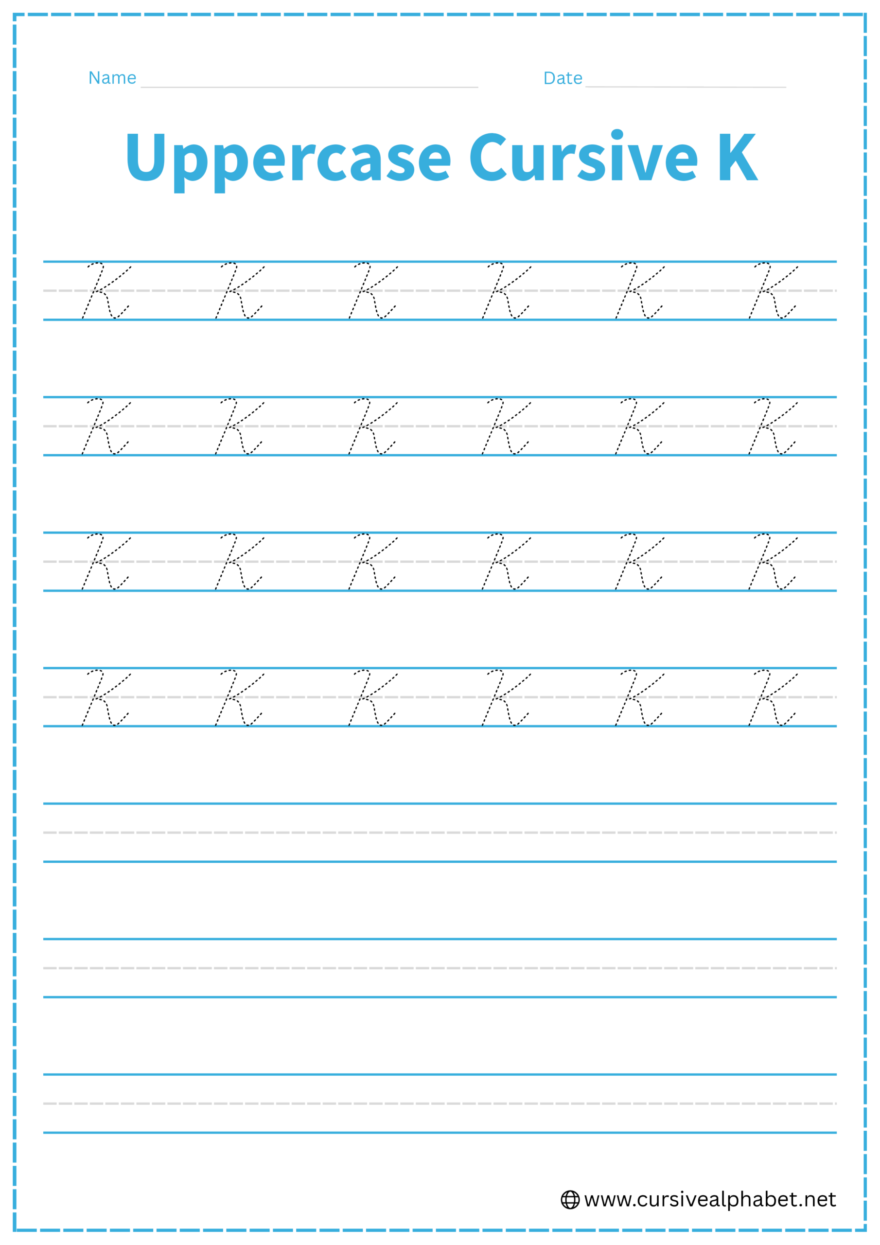
How to Write Uppercase Cursive K
The uppercase K is typically written in two separate pen strokes.
- Start at the top line, draw a slightly slanted line down to the bottom baseline, and finish with a small curl to the left.
- Lift your pen and start back at the top line, about a finger-width to the right of your first stroke.
- Curve down and inward to touch the middle of your first stem (at the middle dashed line).
- Many styles add a tiny loop where the arm meets the stem for extra flair.
- From that middle point, slant back out to the right until you hit the bottom baseline.
- Curve the tail upward to connect to the next letter.
Common Mistakes to Avoid
Lowercase Cursive K
- Making the “bubble” too large can make it look like a capital R.
- Leaving a gap between the bubble and the stem.
- Forgetting the retrace, which makes the letter look like two separate shapes.
Uppercase Cursive K
- Disconnecting the two parts: The “arm” must touch the stem to be recognizable.
- Starting the second stroke too low, which makes the letter look squashed.
- Crossing the stem too far, which can make it look like a messy H.
Frequently Asked Questions
Yes! The exit stroke at the bottom of the “leg” is designed to flow right into the next lowercase letter.
A lowercase h has a smooth “hump,” while a lowercase k has a closed “bubble” and a diagonal “kick.”
Focus on forming the tall stem first, then create the small “bubble” at the middle line, and finish with the diagonal “kick” down to the baseline. This helps maintain smooth flow and proper proportions.
Lowercase h has a simple hump that connects smoothly, while k includes a closed “bubble” in the middle and a slanted “kick” for the leg, giving it a distinct shape.
Yes! The exit stroke from the bottom of the “leg” is designed to flow into the following letter for continuous cursive writing.
Avoid making the bubble too large, leaving gaps between the bubble and stem, starting the second stroke too low, or crossing the stem incorrectly. These errors can make K look like H or R.
Yes! Free printable cursive K worksheets are available. They let you trace and write both uppercase and lowercase K to improve stroke flow, spacing, and handwriting consistency.
Short, daily practice works best. Focus on smooth loops, accurate angles, and consistent height for both uppercase and lowercase K.