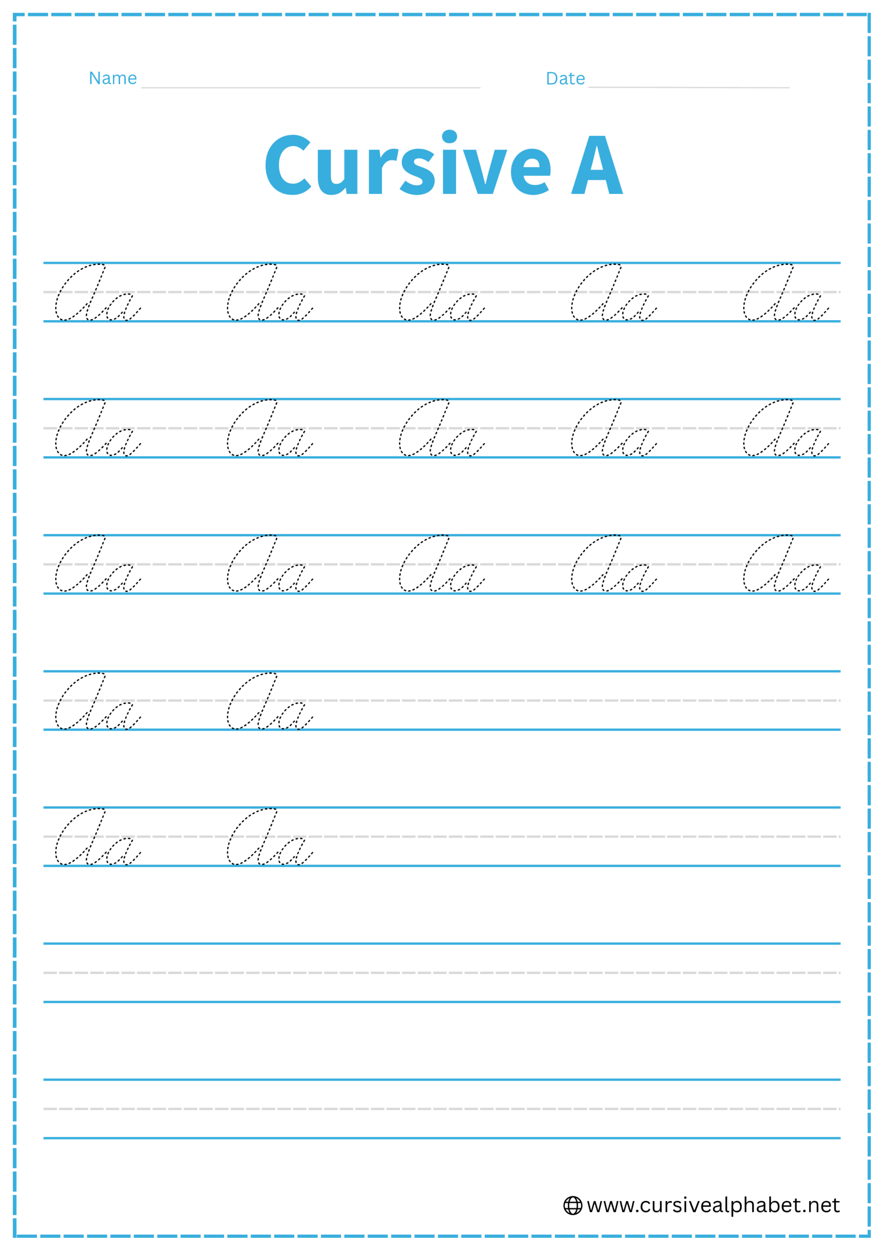
Cursive A
Learning the cursive A is a great first step toward mastering cursive handwriting. On this page, you’ll learn how to write both uppercase and lowercase cursive A with simple instructions and download free printable worksheets to practice and improve your writing.
How to Write A in Cursive
Mastering the cursive A is easier than you think! Follow our step-by-step guide to write both lowercase and uppercase cursive A with smooth, flowing strokes. Practice along the way and avoid common mistakes to make your handwriting look neat and confident.
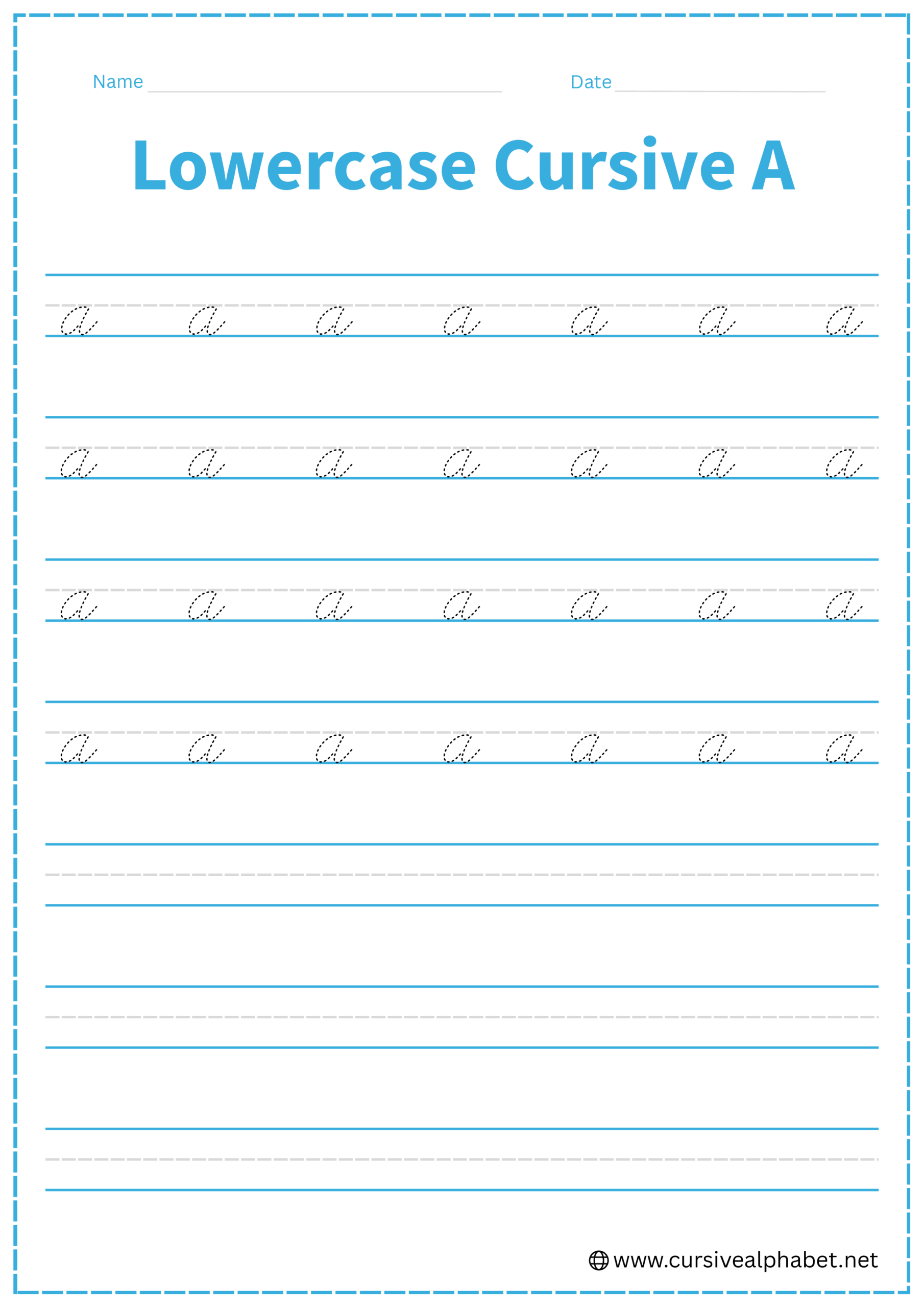
How to Write Lowercase Cursive A
Follow these simple steps to write lowercase a in cursive:
- Start at the bottom line and make a small upward curve to reach the middle line.
- Loop back down to the bottom line, forming a smooth oval shape.
- Finish with a short tail that connects easily to the next letter.
- Practice slowly at first, then increase speed as your strokes become smooth and consistent.
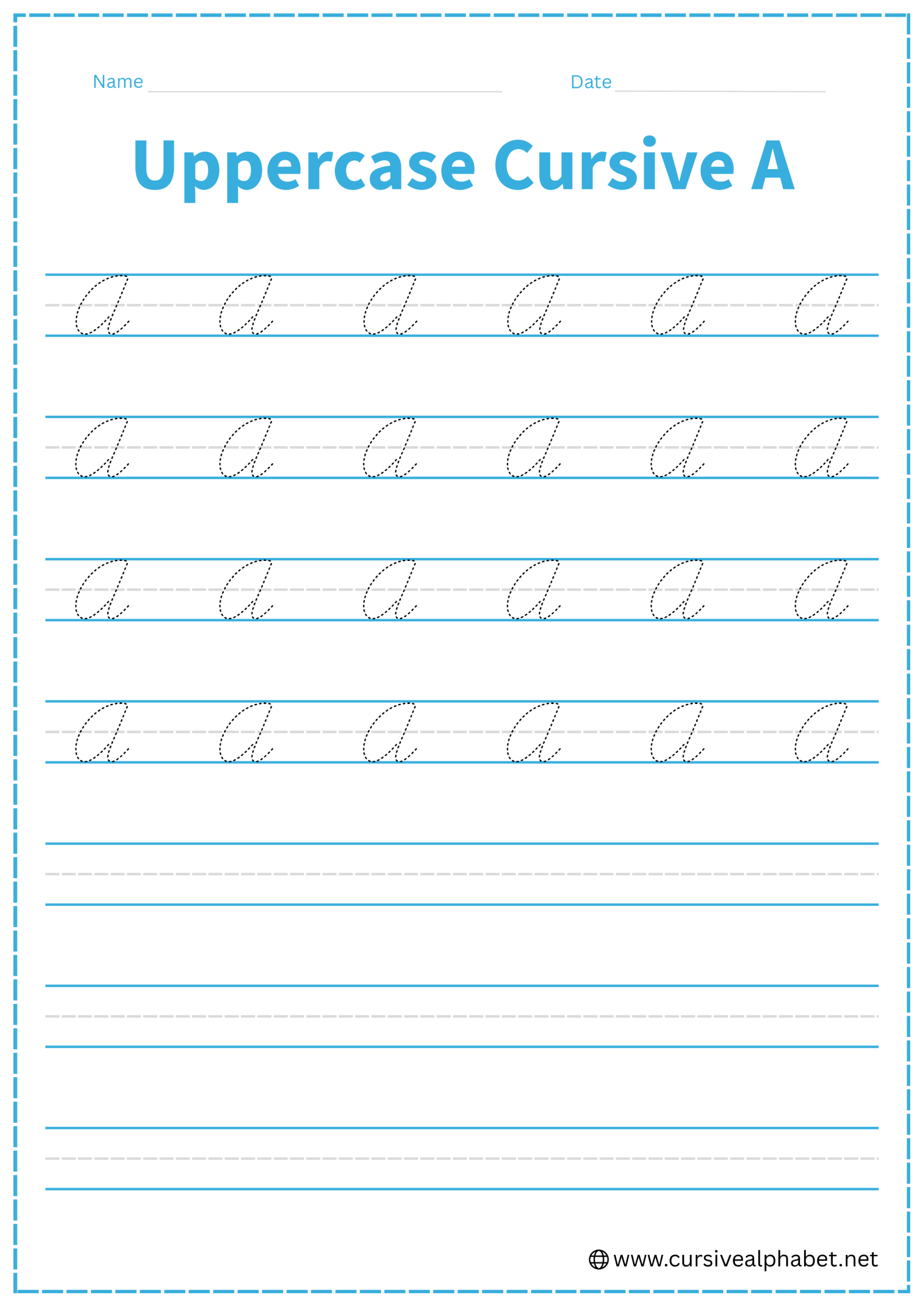
How to Write Uppercase Cursive A
Follow these simple steps to write the uppercase cursive letter A.
- Start at the top line and draw a slight upward curve toward the middle line.
- Loop down and around to form a pointed oval shape that touches the bottom line.
- Bring the stroke up and add a decorative tail or connector to join the next letter.
- Keep your movements smooth and consistent for a balanced letter.
Mistakes to Avoid
Lowercase Cursive A
- Starting in the wrong place: Always begin your stroke at the bottom line, not the middle or top.
- Making the oval too tall or wide: Keep it proportional to your three-lined worksheet for neatness.
- Skipping the connecting tail: Forgetting the tail can make joining letters harder.
- Pressing too hard: Heavy strokes can make the letter look uneven; keep your pen light and flowing.
- Rushing: Take your time with each stroke; smooth and steady letters look best.
Uppercase Cursive A
- Starting at the wrong line: Always begin at the top line to maintain proper height.
- Oval shape too wide or narrow: Keep the letter balanced within your three-lined worksheet.
- Skipping the connecting tail: Forgetting the tail makes joining letters harder and breaks the flow.
- Uneven strokes: Pressing too hard or too lightly can make the letter look inconsistent.
- Rushing the strokes: Smooth, steady movements create a polished and elegant uppercase A.